"Tripland" Case Study

Tripland is an all-in-one trip planning app that helps travelers to be organized.

cover pic
  • Client: Self project
  • Date: January 2022
  • Duration: 3 weeks
  • My roll: UX/UI Designer
  • Tools: Figma, Google Suit, Maze, Adobe color

view Prototype
Responsibility:
  • Conduct user research
  • Survey
  • Interview
  • Sketch
  • Wireframe
  • Branding
  • Prototype
  • Usability test

Introduction

Summary, Problem, Solution, Audience

Summary

When I was in a trip I realized that what travelers doing and what is their problem and I realized this.

Travelers need to plan their trip and have all of the information in one place. Currently they buy their tickets, reserve their hotels and other stuff in different apps and they have all document separate.

Secondly, They wanted to be able to share them with their fellow traveller, for example sharing the flight ticket, hotel information, and other activities.

Additionally, after trip they talk about their trip experiences and they like to share their experiences with other people like their friends or family for inspiration.

Problem

For planning a trip, people has to use several app or website
All trip information and documents like flight, hotel, car, activity and... are seperate
Share trip information with fellow traveler by sending screenshot or sending message

Solution

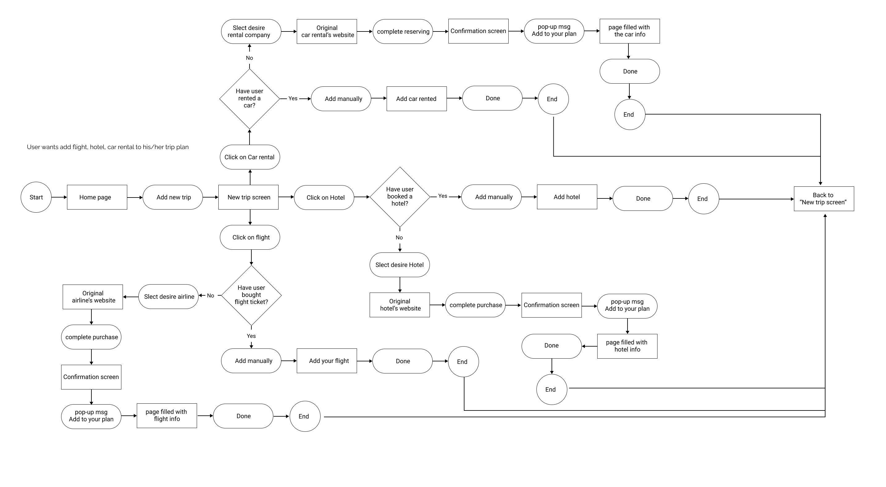
Design an app that solve the disorganized problem, by keeping all documents for a tripin. User be able to buy flight ticket, reserve hotel, renting a car through the app by connecting them o the original website for purchase and when the purchase completed, user will see a pop up message to add that to their plan. On the other hand, since some travlers use their favorite apps for using discount or finding cheapest price, we have that option that user can add that information manually to their trip plan.
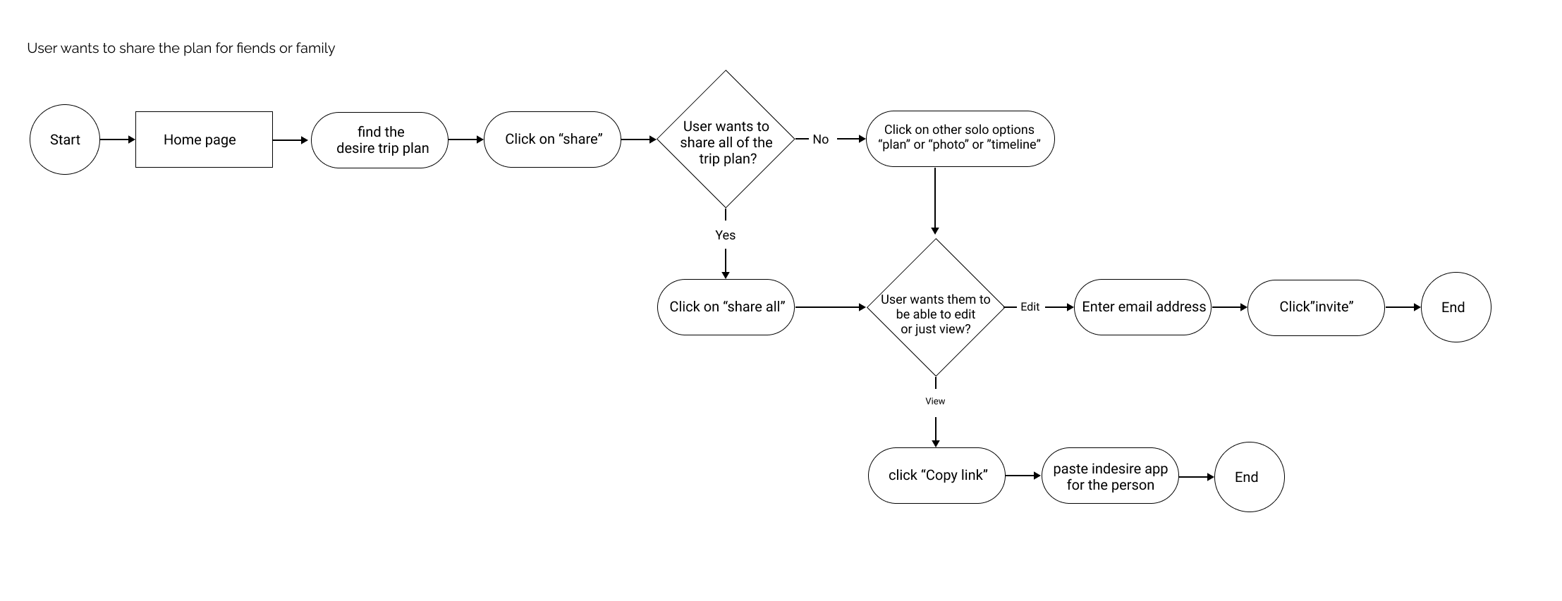
Additionally we add the “share” option for different situations for traveler. For example they want to share the trip with a fellow traveler that need access for editing the plan. Or want to share with some people for just inspiration and using their experiences.

Audience

People who go to travel frequently
Organized traveler
Who has fellow traveler or wants to share their trip plan experience with other
Discovery

Competitive analysis, Summary of survey, Summary of interview

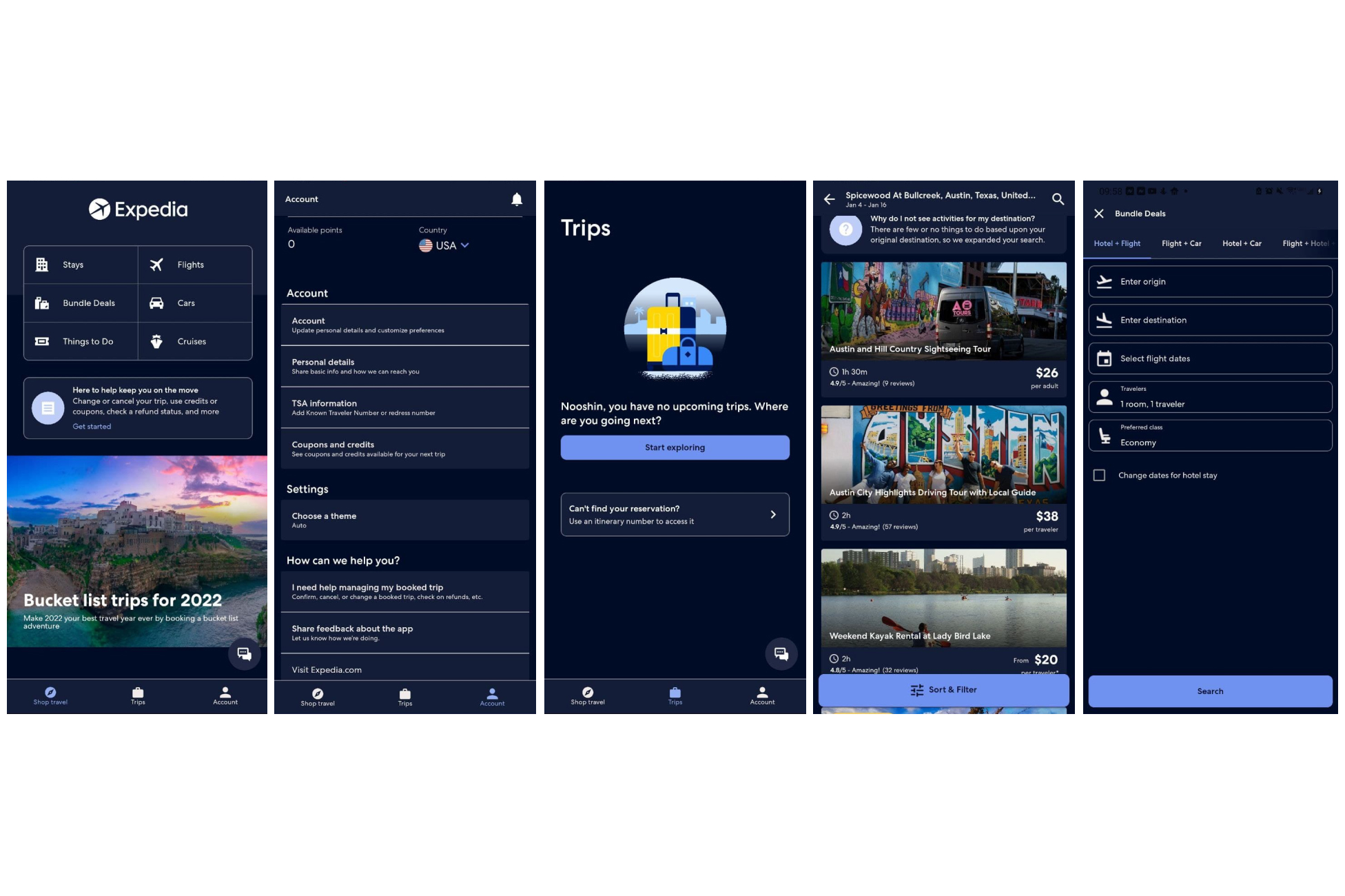
Competitive analysis

expedia

Expedia

Strengths:

Great for booking car, flights, hotel, packages
Offers discounts
UI and visual is clear and nice

Weakness:

It is not for scheduling a whole trip
It’s not good for personalized planning
Overwhelmed with so much information
“things to do” just shows the payable places

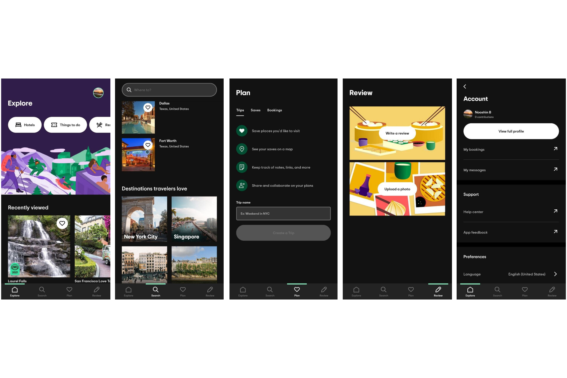
trip advisor

Trip advisor

Strengths:

Nice and clean UI
Option to reserve Hotel
Forums option for communicate with other travelers
save plan and trips
sharable trip plan
ability to write reviews and upload photos for public

Weakness:

It doesn’t have an option for flight
No option for car rental
It is not a complete trip planner


Summary of survey

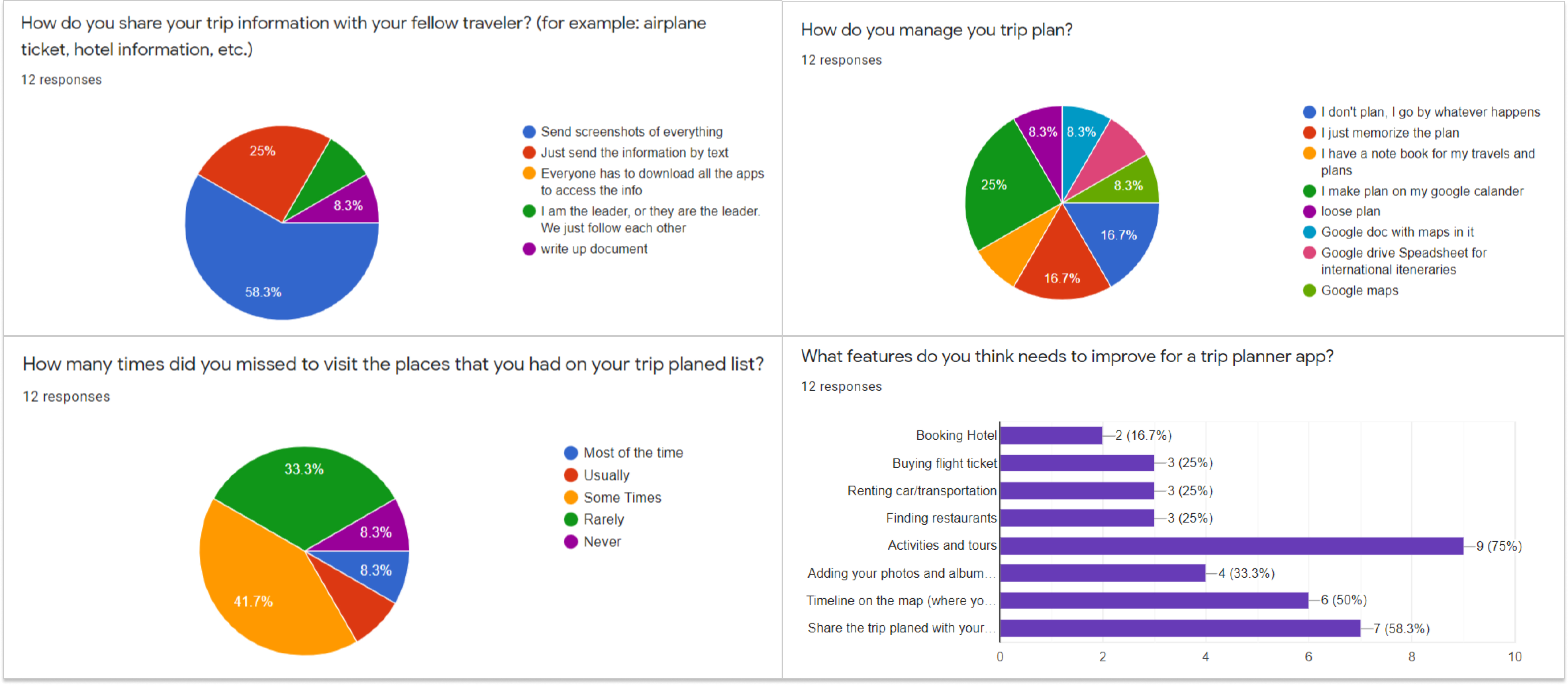
I created a survey by Google Form included with 11 main questions and 4 demography questions. 12people answer the survey.
%58.3 age between 26-35 years old, %33.3 age between 36-45 years old, %8.3 more than 56 years old.
%66.7 Married, %25 Single
Their job situation, %53.6 insite job(in-person), %36.4 hybride
%91 of them don’t go to trip alon. I also had a box for them to write their frustration, feedback or suggestion for having better experinec in planning their trip:
"in fellow traveler's that use the app can share recommendation or itineraries to save other travelers time if traveling the same area."
"Everything in one map"
"An app that shows the weather, if parks are closed or not, …"
"Suggestions and advice from locals in order to have an authentic experience"

Survey


Summary of interview

I had interview with four people and asked them about their trip planning experiences.
overall from the interview:
They use some app to find the best deals, compare prices and find the cheapest prices Everyone likes Expedia because it offers good prices. They use Google calendar, or Google sheet They didn’t know any app that has everything ,all in one with purchase and scheduling. Everyone share the plan with their partner just verbally or by sending screenshot They said it is nice to save the trip information and be shareable with friends and family for inspiration.

Define

Persona, User Journey, User Stories, User Flow, Site Map

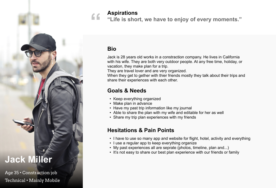
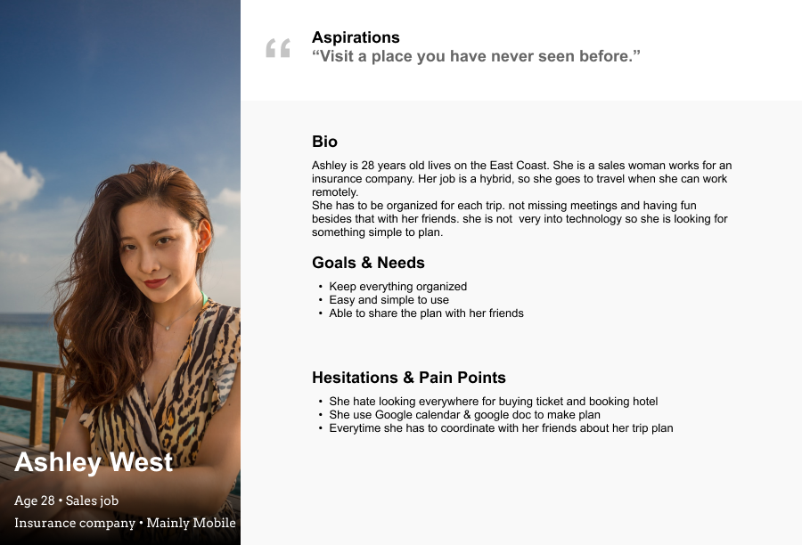
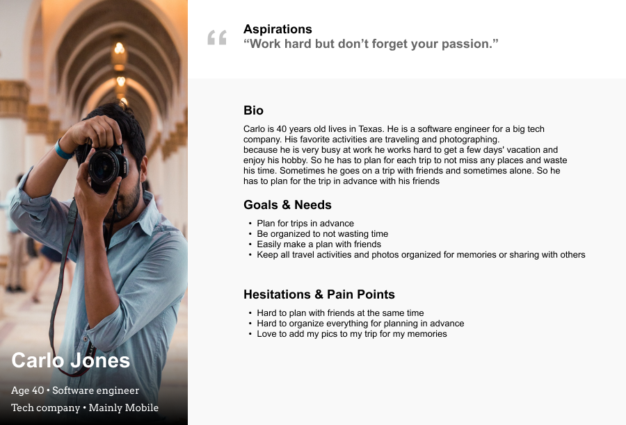
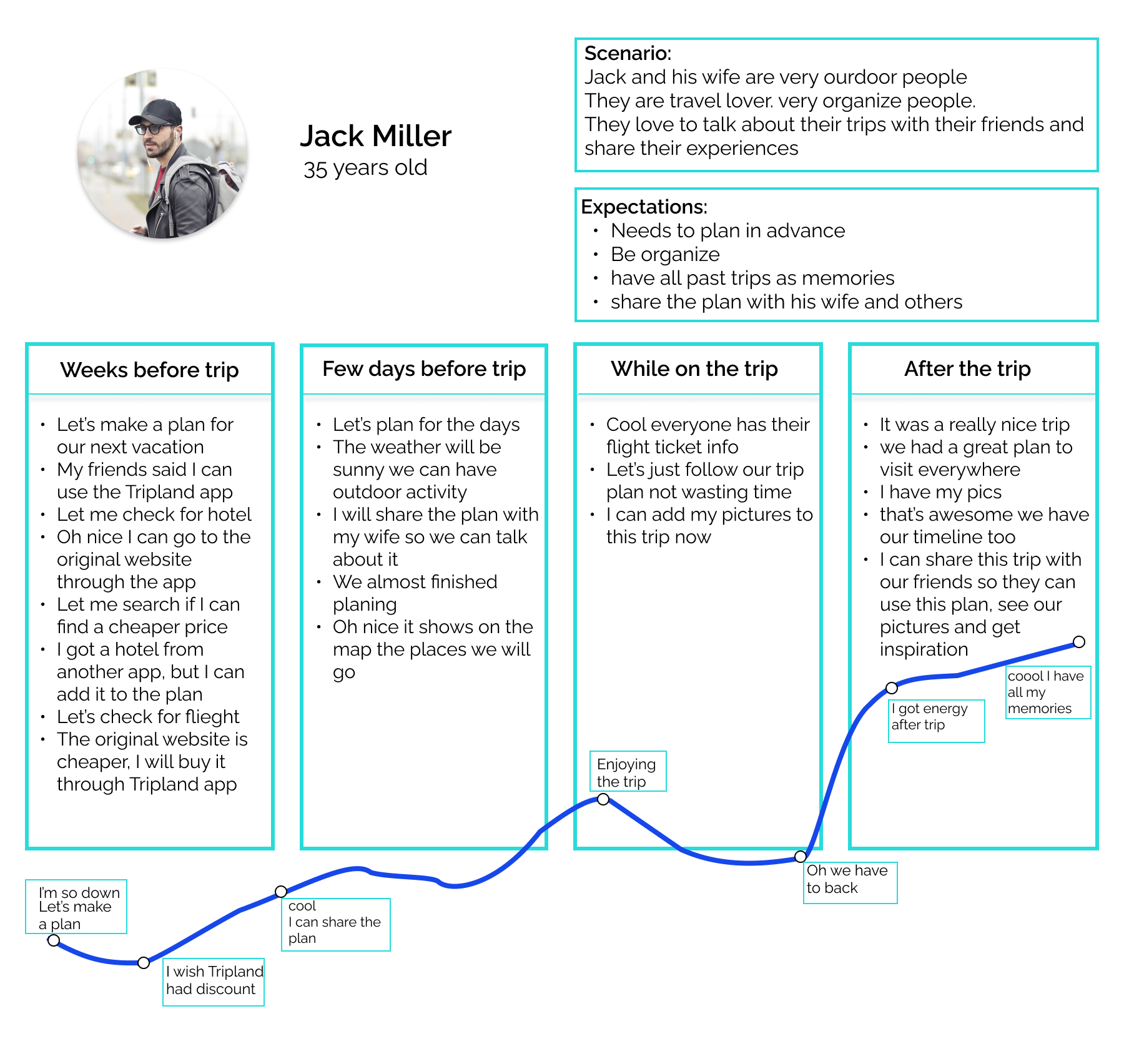
After I gathered information about users from survey and interviews, I made Persona, User journey and User stories.
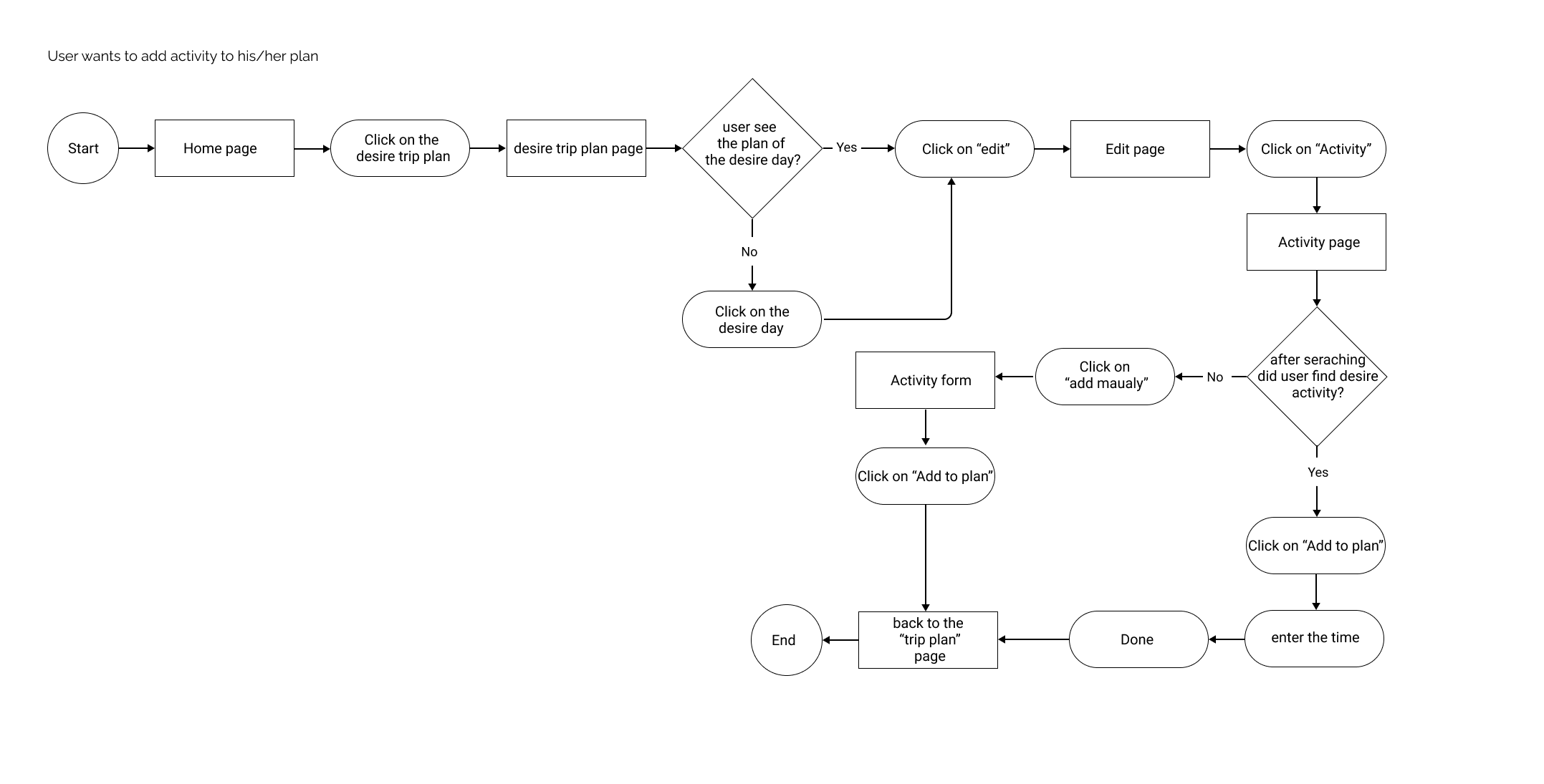
And follow by them User flow and Site map.

Persona

Persona1

Persona2

Persona3


User Journey

User Journey


User Stories

1. As a traveler, I want to buy a flight ticket, book a hotel, rent a car, and add them to my new trip plan, so I can have access to them easily.
2. As a traveler, I want to plan and add activity to my trip planned any time, so I won’t waste my time checking around and missing any places.
3. As a traveler, I want to share the trip planned with my friends (who want to come with me), so they can have access and know the planned schedule.
4. As a traveler, I want to inspire and share my trip pictures, tips, and my trip program with others, so they can enjoy my experiences.
5. As a traveler, I want to see the timeline with my stops on the map, so I can see where I have been.


User Flow

userflow1 userflow2 userflow3


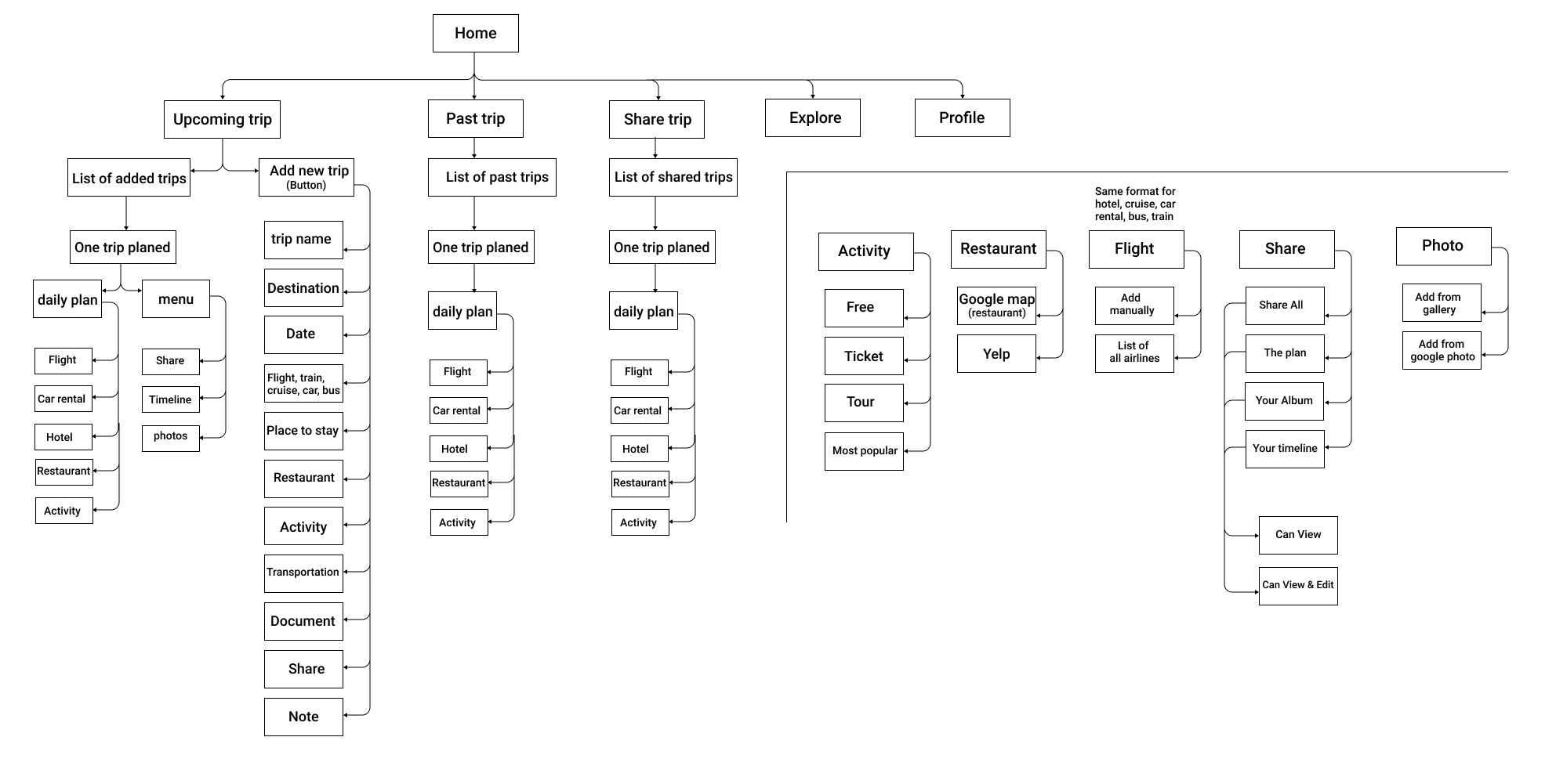
Site Map

sitemap

Development

Sketch, Low-Fidelity Wireframe, Usability Test and feedback, Branding, High-Fidelity Wireframe


Sketch

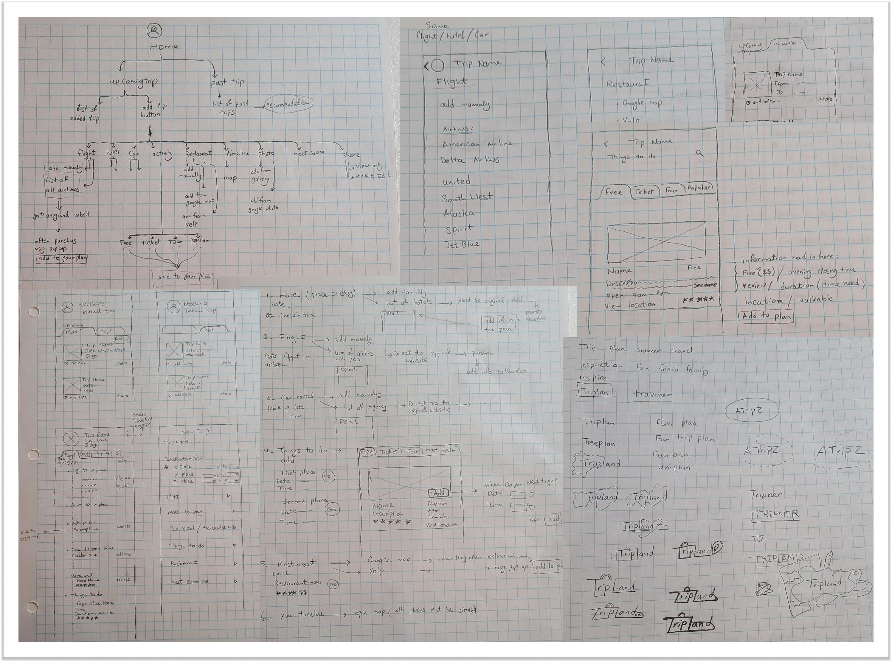
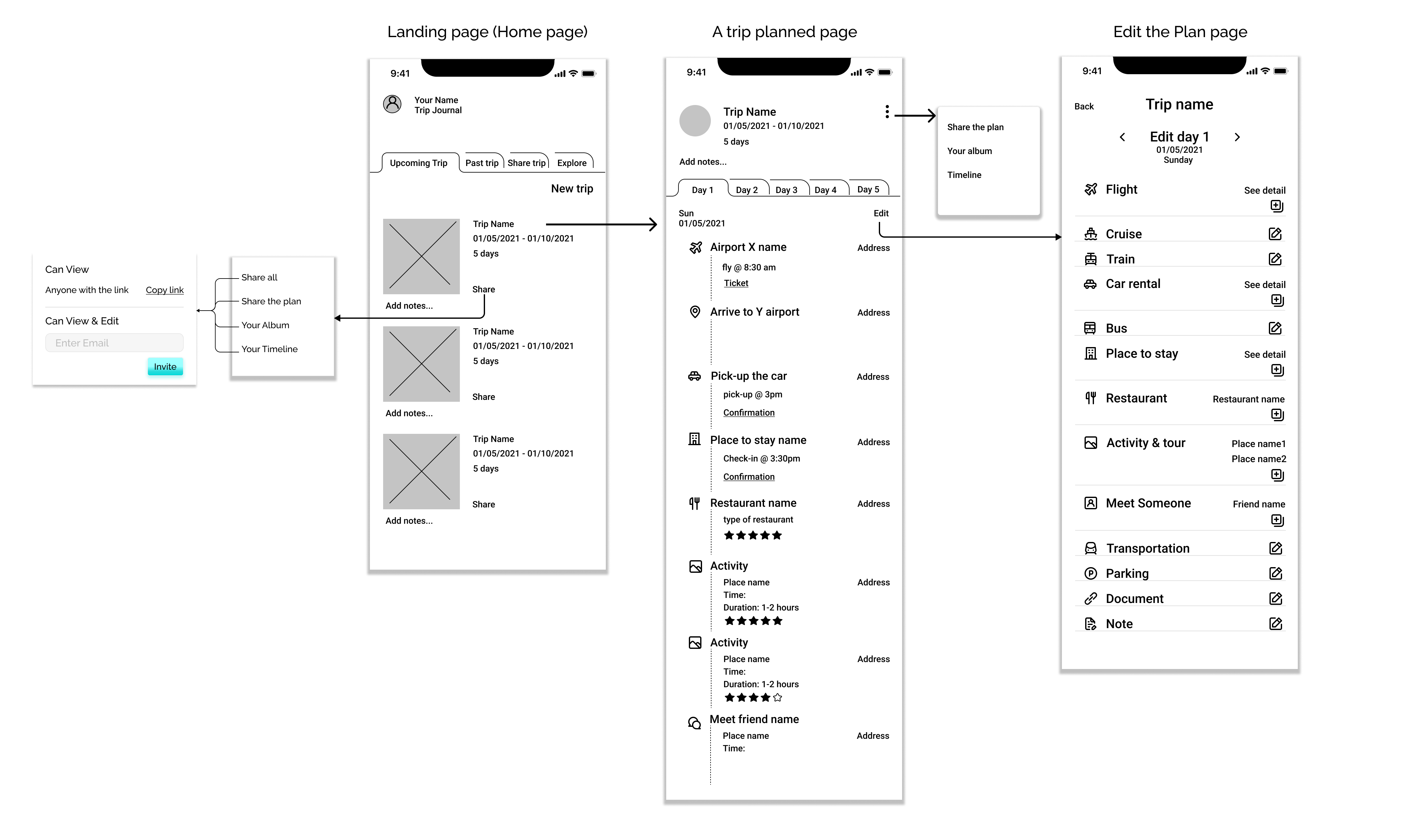
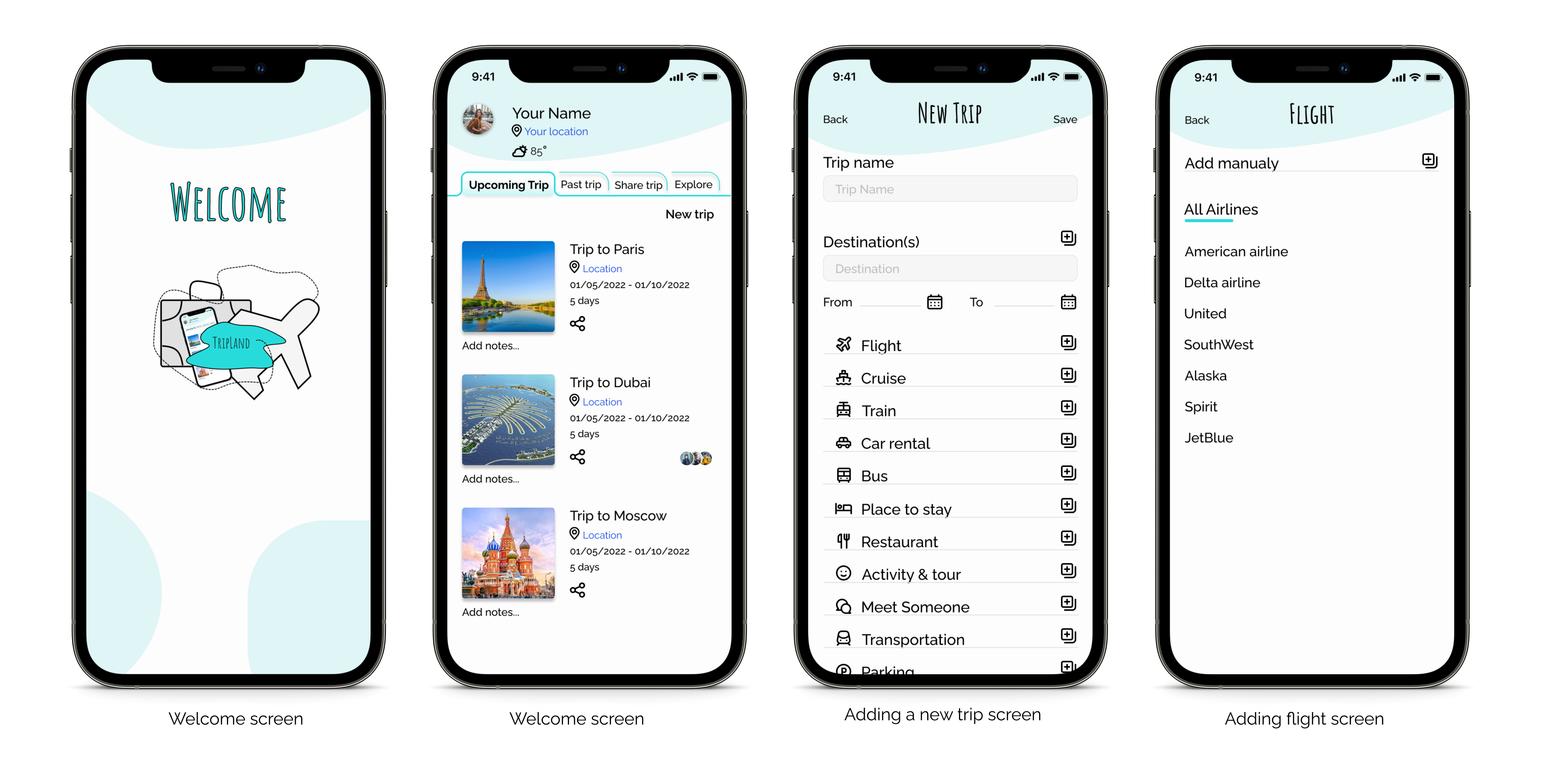
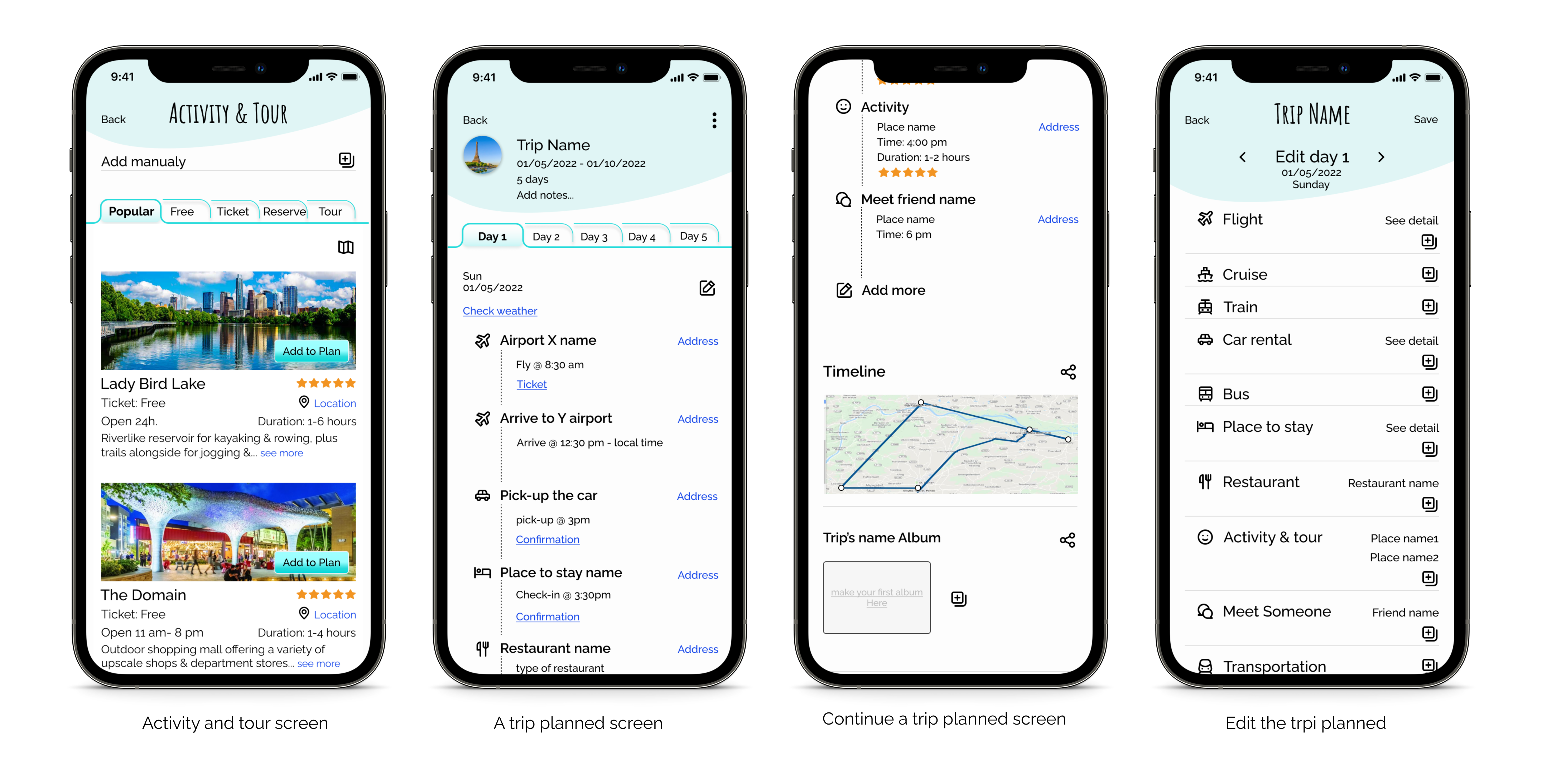
Based on user research, and competitive analysis, based on the users’ needs I started by creating sketches on paper. so that I could map out which features I wanted on each screen and how the layout should look. I drew the Home page, I should have on that, then I drew the page that planned, how it should look and how I can fit the information and document in time order. Other page about how user should edit their plan, and screen for adding a new plan.

sketch


Low-Fidelity Wireframe

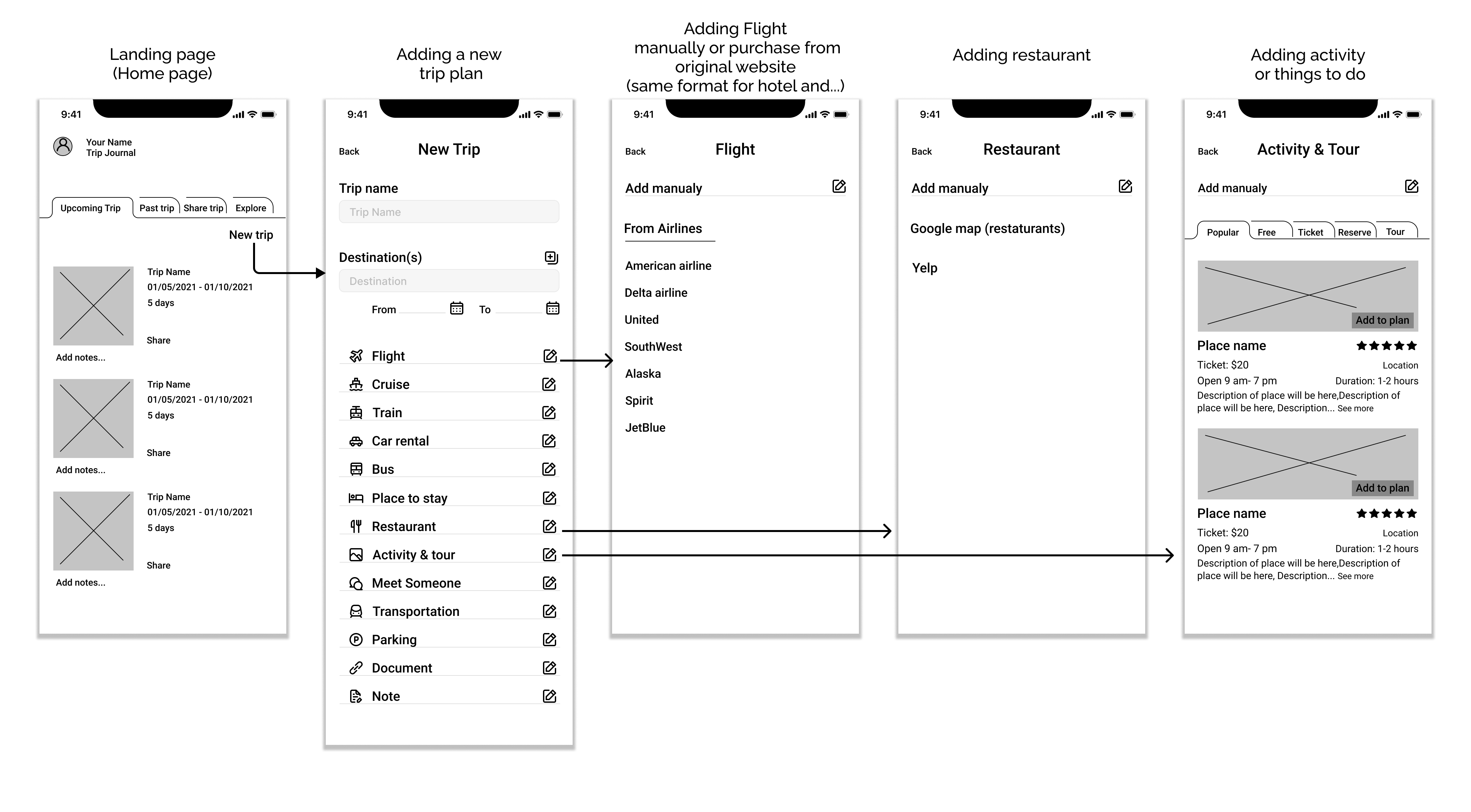
After I sketches the wireframe and implementation some ideas, I received feedback from test participants and I made my Lo-Fi wireframes on Figma.

LoFiWireframe1 LoFiWireframe2


AB Testing

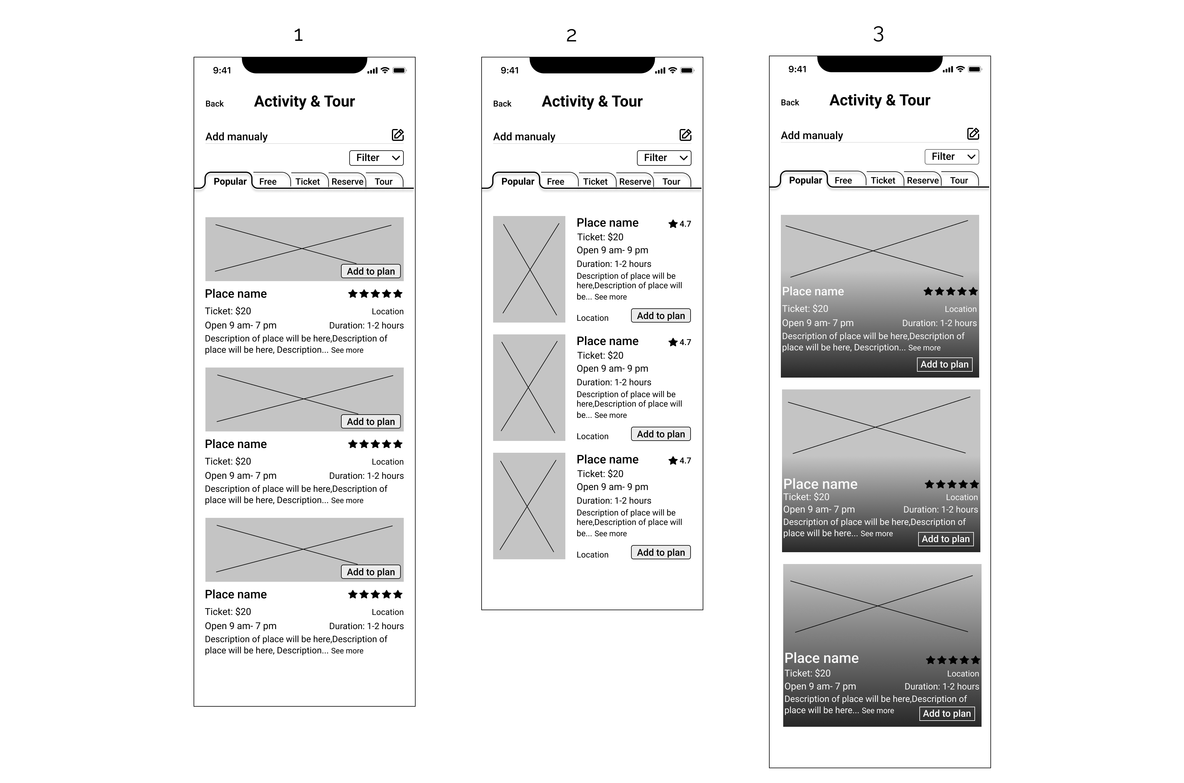
For creating the :Activity & Tour” Page I came up with three different style. I did AB Testing to use the best one. Style #1 got the most vote.

AB test


Branding

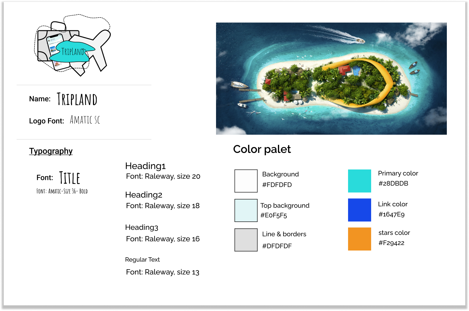
For branding I did some research about what we have on the market for creating mood board, creating logo and name.
Tripland came of Trip+Plan and by adding a D at the end gives another meaning Trip+Land. So Tripland is a land for plan your trip.
The blue aqua color is the color of some nice island and inspired of Maldive islands.

Branding


Usability Test and feedback

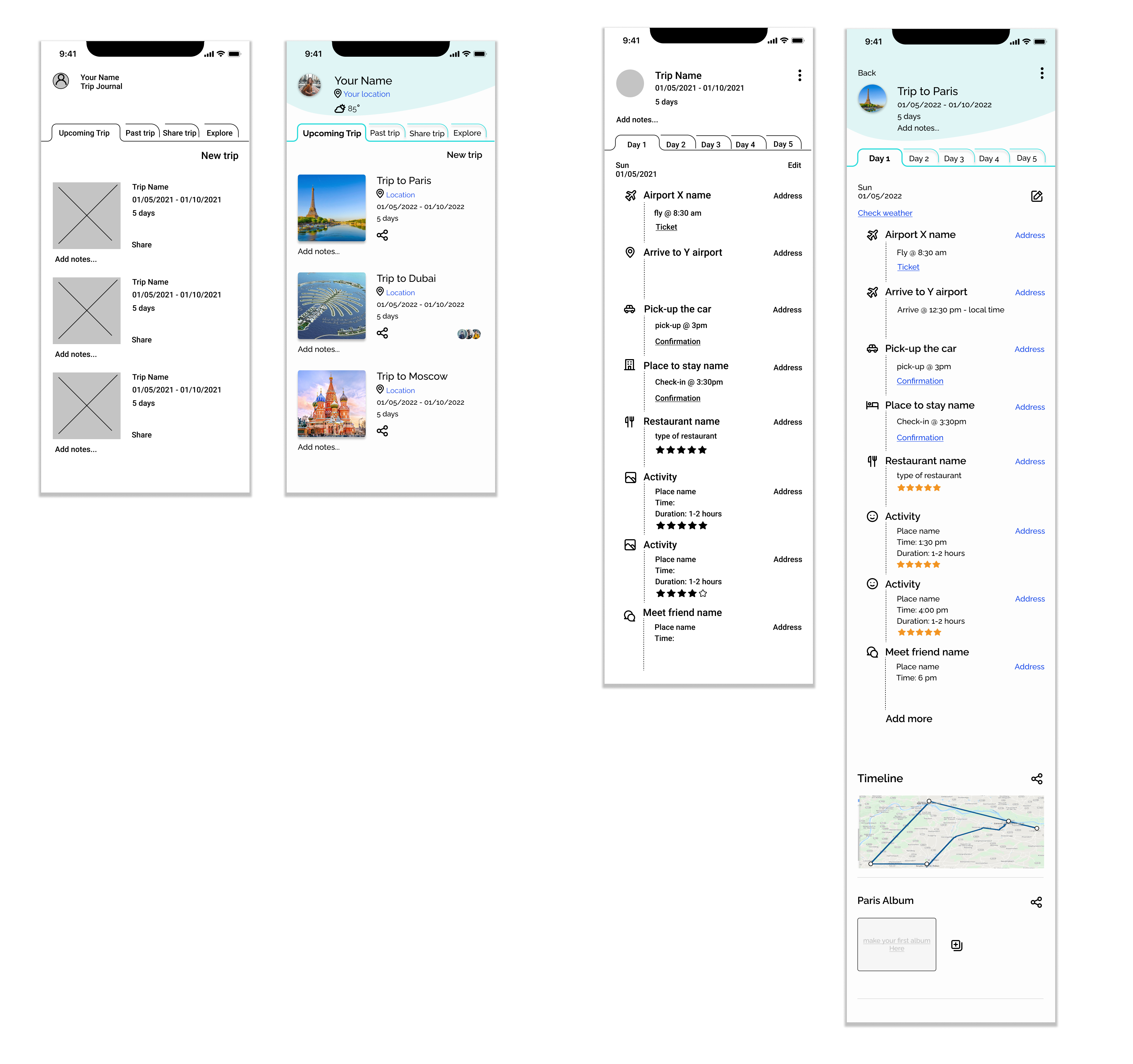
After creating the lLo-Fi wireframes and working on visuals I had some tests and received some feedback.
I did some changes, like adding location for user and for the trip.
Adding a weather forecast. when user is planning for a day they can decide to having an outdoor or indoor activity.
Adding the timeline and photos on the planed screen to be more accessible.
And at the end I changes some icons (Place to stay, activity and tour, meeting someone)

Revision


High-Fidelity Wireframe

HiFiWireframe HiFiWireframe


Delivery

Prototype, Usability Test, Final Product

Prototype

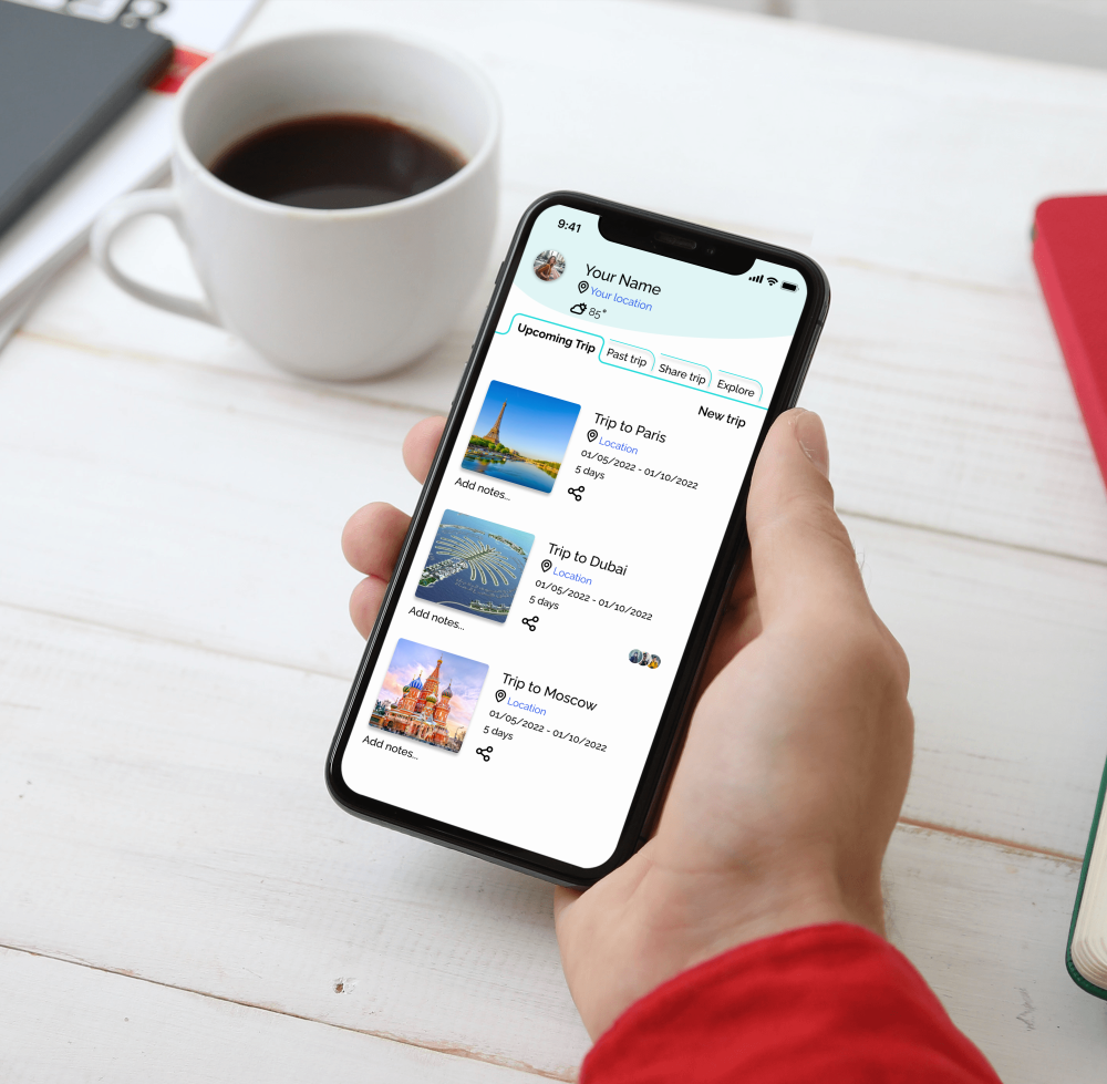
On the next stage I made the clickable prototype.

view Prototype
cover pic


Usability Test

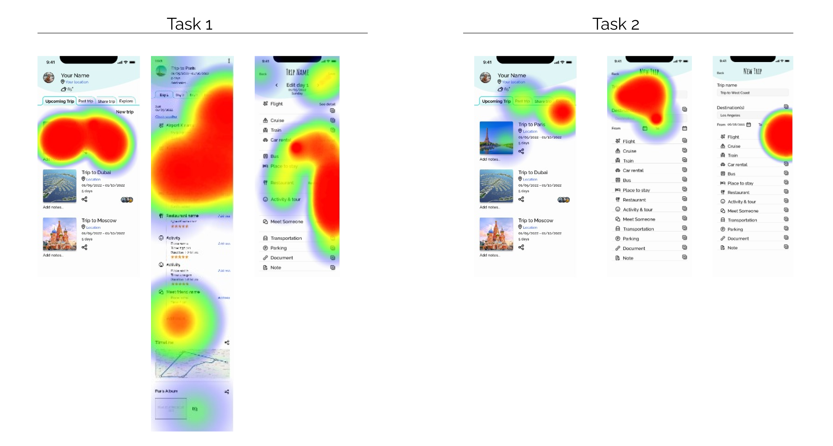
10 people tested by Maze
1 person, in-person
I asked them to complete these tow tasks:
Task1: Your upcoming trip is going to Paris, review your plan and add another activity to it.
Task2: You have plan to go to LA. Add you new trip to your list, and click to add your flight as well.
2/10 couldn’t complete tasks, but others successfully completed them.
I got some feedback about the UI it’s nice and clean.
Overal the 2 screens, “planed trip” and “edit page” need to improve in clickable places.
First task was kind of confusing for users.
I have to activate few places for opening a trip. Some users clicked to add more, so I will activate that.
users cliked everywhere for adding activity. maybe my question was confusing.

Maze

Next step

What I have learned with this project is UX Design is a team working project. Designing for Best User Experience always needs more communication, more user research and more user testing. On the next step, I will fix the confusion and improve the prototype. Do more testing to get to the best User Experiences.


© 2021 Nooshin Boroomand.