"HiBus" Case Study

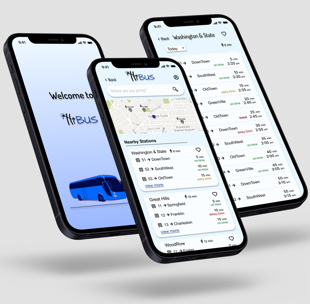
The HiBus is a mobile app for Midwestern city, which is for tracking buses schedule.

  • Date: November 2021
  • Duration: 3 weeks
  • My roll: UX/UI Designer
  • Tools: Figma, Google Suit, Miro, color contrast checker

view Prototype
Responsibility:
  • Conduct user research
  • Survey
  • Interview
  • Sketch
  • Wireframe
  • Branding
  • Prototype
  • Usability test

Introduction

Summary, Problem, Solution, Audience

Summary

The HiBus is a mobile app for Midwestern city, which is for tracking buses schedule that allows commuters to easily identify what bus is coming and when it is arriving in bus stops.

The current bus schedule is listed on the city’s website and posted at each bus stop, but this information quickly becomes inaccurate when traffic, maintenance issues, and assisting handicap passengers are taken into account.

Additionally, ever since the city added new bus routes, there has been an increase in congestion, confusion, and frustration for commuters, especially at certain stops where serve several bus lines.

Problem

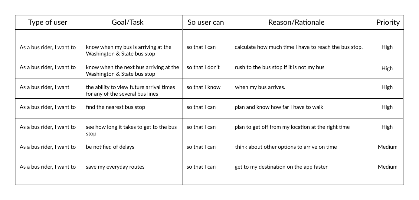
Since the transit system added more routes, and many of those routes, stop at the same bus stop, the trasite office identified some problems for riders. Riders are currently complaining the most about the bus stop at Washington and State, which is served by several bus lines. Riders want to... Know how much time they have to get to the Washington & State stop. Know when the next bus will arrive at the Washington & State stop. View future arrival times for any of the several bus lines (serving Washington & State)

Solution

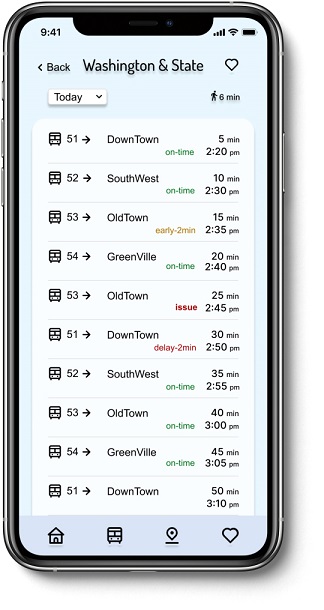
Designing a bus app that easy to use and navigate, delivers information clearly and efficiently, upfront, and shows How long riders need to walk to get to the bus stop All bus lines that has stop at that station Bus arrival time at the bus stop Future arrival time

Audience

The audience are students and employees and regular bus riders who use the bus to commute on a daily basis.
Discovery

Competitive analysis, Summary of survey, Summary of interview

Competitive analysis

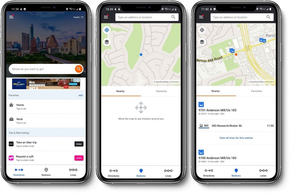
Moovit

Moovit

Strengths:

Nice, simple, and clear interface
Shows the entire line from start to finish as well
It shows the full schedule for a day for one station
It has Point option

Weakness:

Have to zoom in to shows the nearby stations
It doesn't show if there is delay or issue

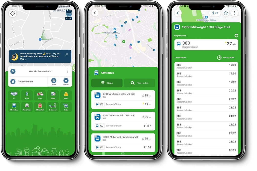
citymapper

CityMapper

Strengths:

Provide few options for commute & public transportation (Metrobus, walk, metro rapid, bike, scooter, cabs)
Provide information for map and issue
It has the option to report an issue

Weakness:

Personaly I don't like the interface, looks busy to me
It doesn't show if there is delay or issue


Summary of survey

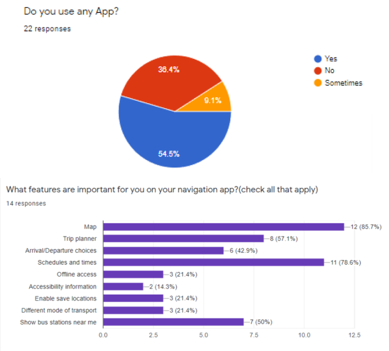
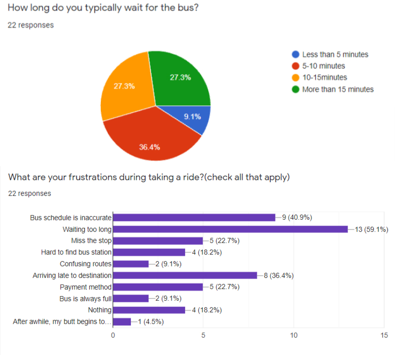
My survey was answered by 22 people wich mostly were aged between 25-45 years old. From the data that I gathered, most of them use app for taking a bus to track the bus schedule, the reasons they use buses is going to work, school, and for their entertainment. The features that they use most on their app are maps and the bus schedule. Their frustrations are waiting too long for their bus at the bus stop waiting and that comes from inaccurate schedule and timing. They liked to know if there is a delay or issue at that time so they can reschedule to not arrive late at their destination.

Survey
Survey


Summary of interview

I interviewed four people. They had different types of being into technology for their daily task. Since they are student and employee time is really matter for them, they have to be on time for their classes and work. They want something that can rely on that, and not have stress if their bus not coming on time. Overall, since time was really important for them, they liked to use an app that is really easy and simple to use and navigate, not complicated and the time schedule be reliable with updates.

Define

Persona, User Journey, User Stories, User Flow, Site Map

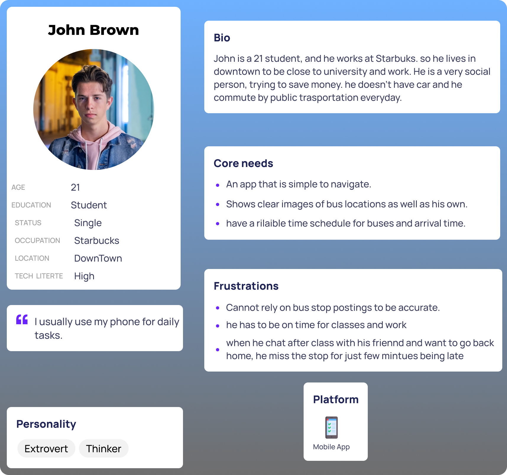
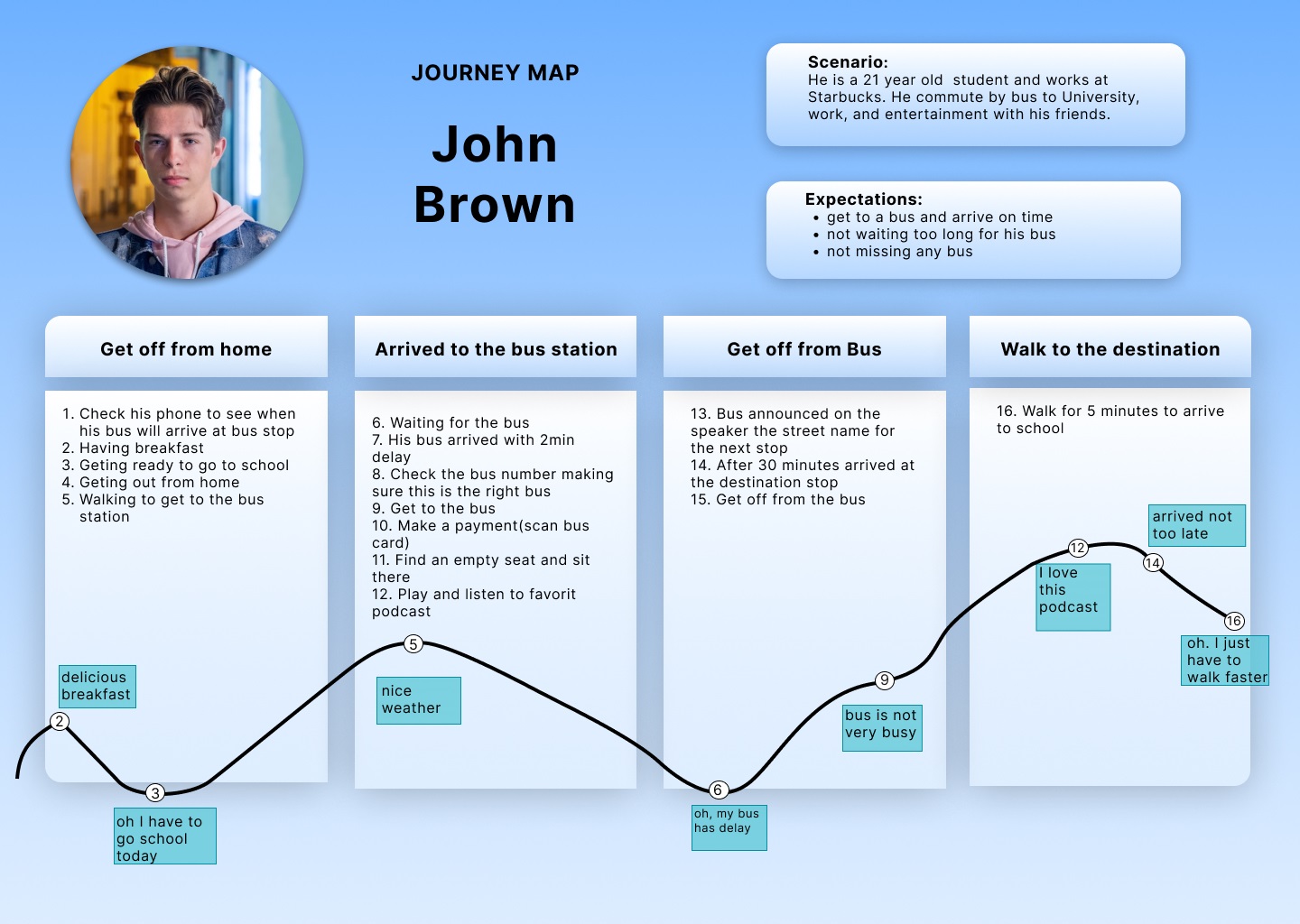
After I gathered information about users from survey and interviews, I made Persona, User journey and User stories.
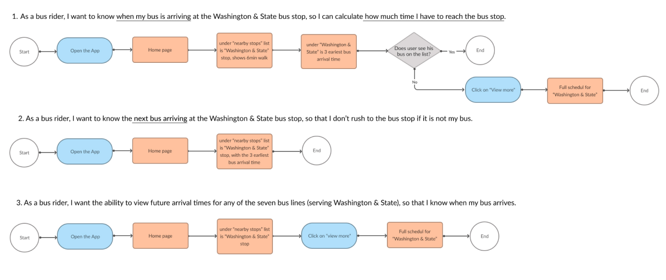
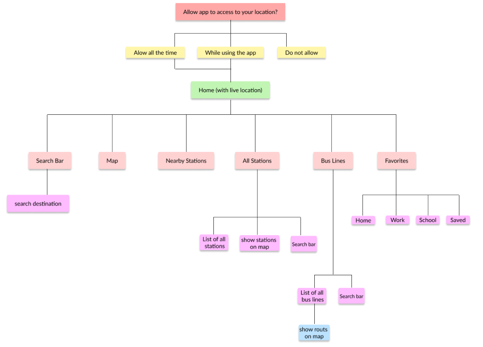
And follow by them User flow and Site map.

Persona

Persona


User Journey

Journey map


User Stories

user story


User Flow

userflow


Site Map

sitemap

Development

Sketch, Low-Fidelity Wireframe, Usability Test and feedback, Branding, High-Fidelity Wireframe


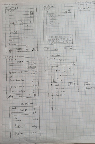
Sketch

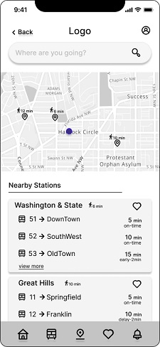
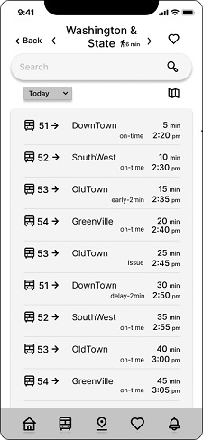
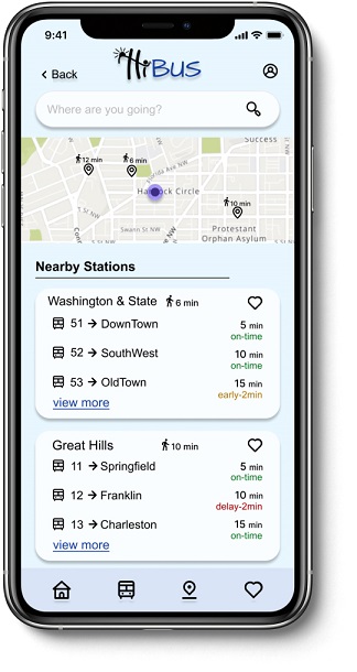
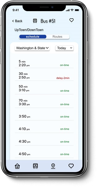
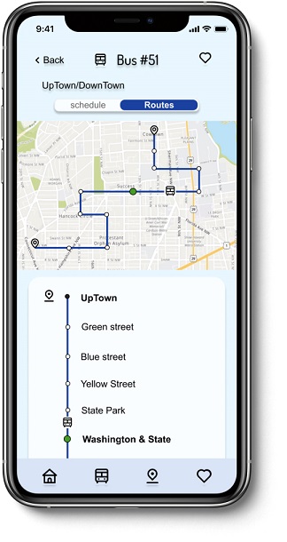
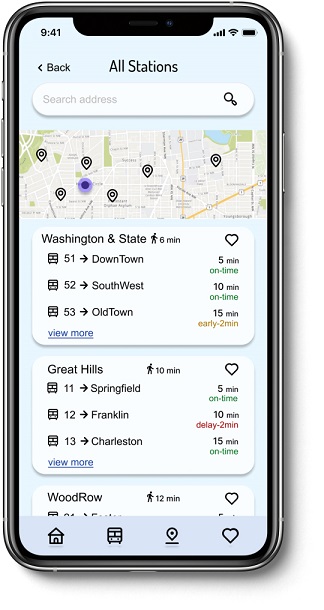
After conducting user surveys, interviews, and competitive analysis, based on the users’ needs I started by creating sketches on paper. so that I could map out which features I wanted on each screen and how the layout should look. the first one is the home page with a search bar for searching the destination, a map which shows the live location with nearby stations, under the map, there is a list of information of nearby stations. when users click on the station name from the list they will see the station scheduled for all day on another page. If users want to see the whole day schedule for only one bus line, they click on the desired bus line and will see the whole schedule for only one bus line on another page. I also included the bus route on the map.

sketch


Low-Fidelity Wireframe

After I sketches the wireframe and implementation some ideas, I received feedback from test participants and I made my Lo-Fi wireframes on Figma.

Home
Stationschedule
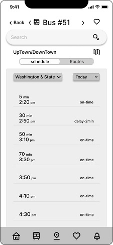
BusSchedule
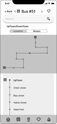
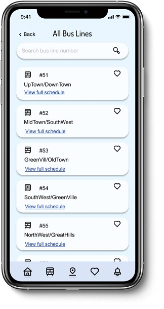
BusRoutes


Usability Test and feedback

After I made the Lo-Fi wireframes, I made the wireframe clickable and I did some usability tests, I received some feedback. Everyone said the design is good, the flow is clear and understandable. I made some changes based on feedback. For example, the font size was small, and the map size needed to be smaller to see more of the nearby stops list on the first sign. Based on the feedback I removed arrows for the “bus stop” and “bus line” pages, it was confusing with the back arrow. I removed the search bar for the “bus stop” and the “bus line” pages. The walking sign for the “Washington & State” stop wasn’t obvious so I change the size and made that bigger.


Branding

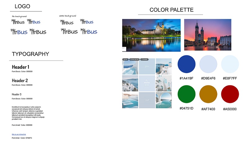
After I made changes I start searching and working on having a mood board, Logo, and Style tile. Based on my search for selecting a color, I found out that most of the transit apps’ color are blue, green and yellow. I have chosen blue because blue feel trusting, relaxed, professional.
For name and logo. I wanted to have a simple name for my app, to be easy to say and easy to remember and also give a good feeling. I chosen some different names and different fonts and based on feedback I got to this final logo.
At the last part I did accessibility test to make sure background color and text are readable and pass the accessibility.

styletile

Previous Next

Delivery

Prototype, Usability Test, Final Product

Prototype

On the next stage I made the clickable prototype.

view Prototype


Usability Test

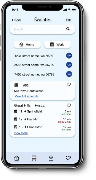
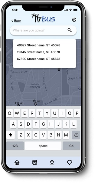
I had 5 participants for test, with different type of using phone in their daily life Everyone completed the 3 MVP with, which are “How long does it take to get to the Washington & State stop? When your bus will arrive? When can you catch your bus?” With no confusing. Everyone clicked on bus line 51 to see the future time for this line. Because that more make sense for them to directly click on buse line to see its future schedule. One person wanted to use the map to select the station. So later I added that option too. The “view more” and walk sign has to become more clear and visible, after the test I made that change.
One recommendation for having a bold color for the background, and one more for having a dark mode design as another option.
Overal everyone was happy with that. They liked the color and design, it is clean and not busy. Not with extra information.


© 2021 Nooshin Boroomand.