03 / Design system
Rebuilding a 52-component design system to WCAG 2.1 AA
Fifty-two components, two months of design, fifteen people. The only way that works is to stop designing components and start designing the decisions underneath them — then prove those decisions rather than assert them.
- Role
- Designer, authored the majority
- Team
- 15 across design, engineering, QA
- Design phase
- 2022 · 2 months
- Used by
- CyberSource product suite
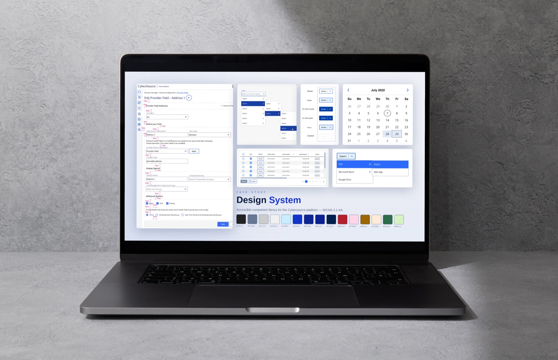
This work is confidential. Screens come from my own design files and some details are generalized.
Context
CyberSource already had a component library. It was in use across the product suite and it worked — but it had been built before accessibility and responsiveness were hard requirements, and it showed. Contrast was inconsistent. Focus states were an afterthought where they existed at all. Components had been drawn at a desktop width and adapted case by case, which meant every team solved the same small-screen problems again on their own.
The mandate was to rebuild it against two non-negotiable requirements: WCAG 2.1 AA and full responsiveness. The design phase was two months. I authored most of the library — I had the capacity at the time, and I took it.
This was not three designers working alone. The program ran with 3 UX designers, 6 engineers, 2 QA, a program manager, a technical project manager, a product owner, and a dedicated accessibility specialist — fifteen people whose work had to stay in step. That is the part of a design system that does not show up in a Figma file, and it is the reason the deliverable had to be more than pictures of components.
Fifty-two components is not fifty-two design problems
The arithmetic makes the strategy obvious. Two months does not allow fifty-two independent design efforts, and if you try, you get fifty-two slightly different interpretations of the same button.
So we front-loaded the decisions that repeat. Nearly every accessibility and responsiveness requirement in the library resolves to a small set of choices that then apply everywhere:
- Color, defined as roles rather than swatches. Each color in the rebuilt palette carries an explicit list of what it is for — borders for active form fields, button borders and text links, status badge fill, disabled state. A color with a stated job cannot drift into a job it fails at.
- Focus. One visible focus treatment that works on light surfaces, on dark surfaces, and on top of colored buttons — the state most often skipped and the one keyboard users depend on entirely.
- Target size and spacing. Minimum interactive dimensions and a spacing scale, so touch targets are correct by construction rather than by inspection.
- Type. A scale from caption through display, with the weight and link variants defined alongside, so text stays readable when a user scales it up.
- Responsive behavior. Rules for how a component reflows, stacks, or scrolls, decided at the pattern level instead of per screen.
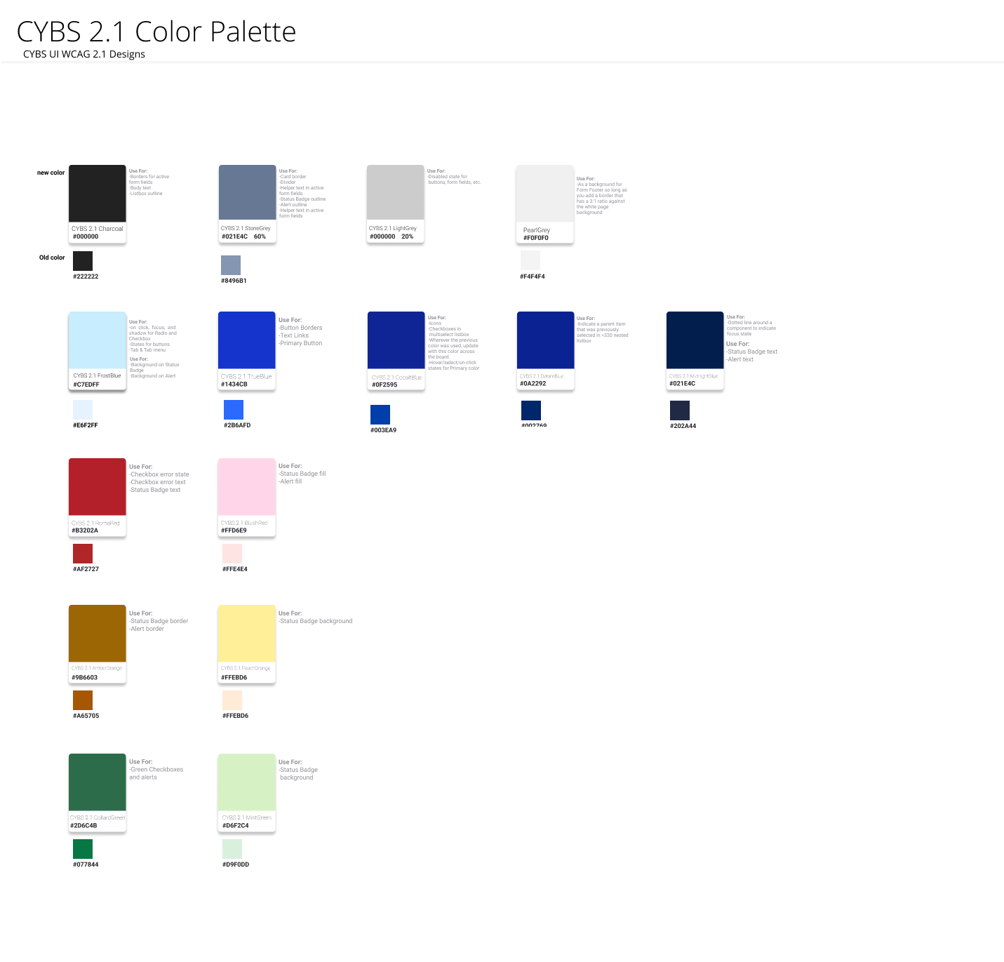
Once those are settled, most components become an application of existing decisions plus their own specific behavior. That is what made the timeline possible, and it is also what makes a library feel like one system instead of a folder of parts.
Proving the palette, not asserting it
The part that mattered most is the least glamorous. Rather than checking contrast on the combinations that happened to get designed, the team scored a matrix of every color against every other color — all 136 pairs.
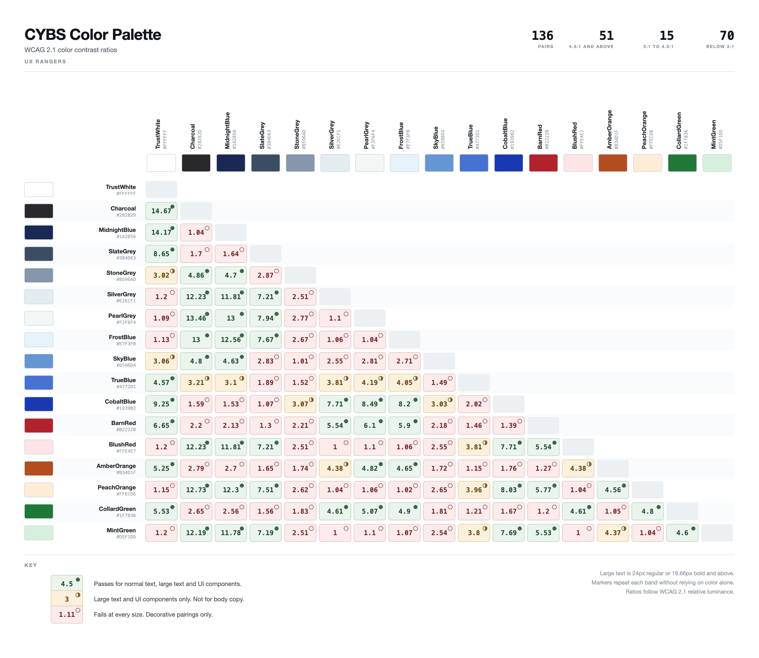
Three bands, one rule each: green clears 4.5:1 and is safe for normal text; amber sits in the middle and is usable only for large text or non-text elements; pink fails and is not a combination anyone should reach for.
The value is that it converts an argument into a lookup. A designer choosing a badge color, or an engineer wondering whether a border is legible on a gray surface, does not need to re-open the question or ask anyone — the answer is already on the page. It is also what settled the borderline candidates: they stayed or went on the numbers, not on preference.
Checking the combinations you happened to use tells you about today's screens. Checking every pair tells you about every screen anyone builds next.
Every state, specified
The rule I held to across the library — and kept using for the rest of my time at Visa — is that a component is not finished at its default state.
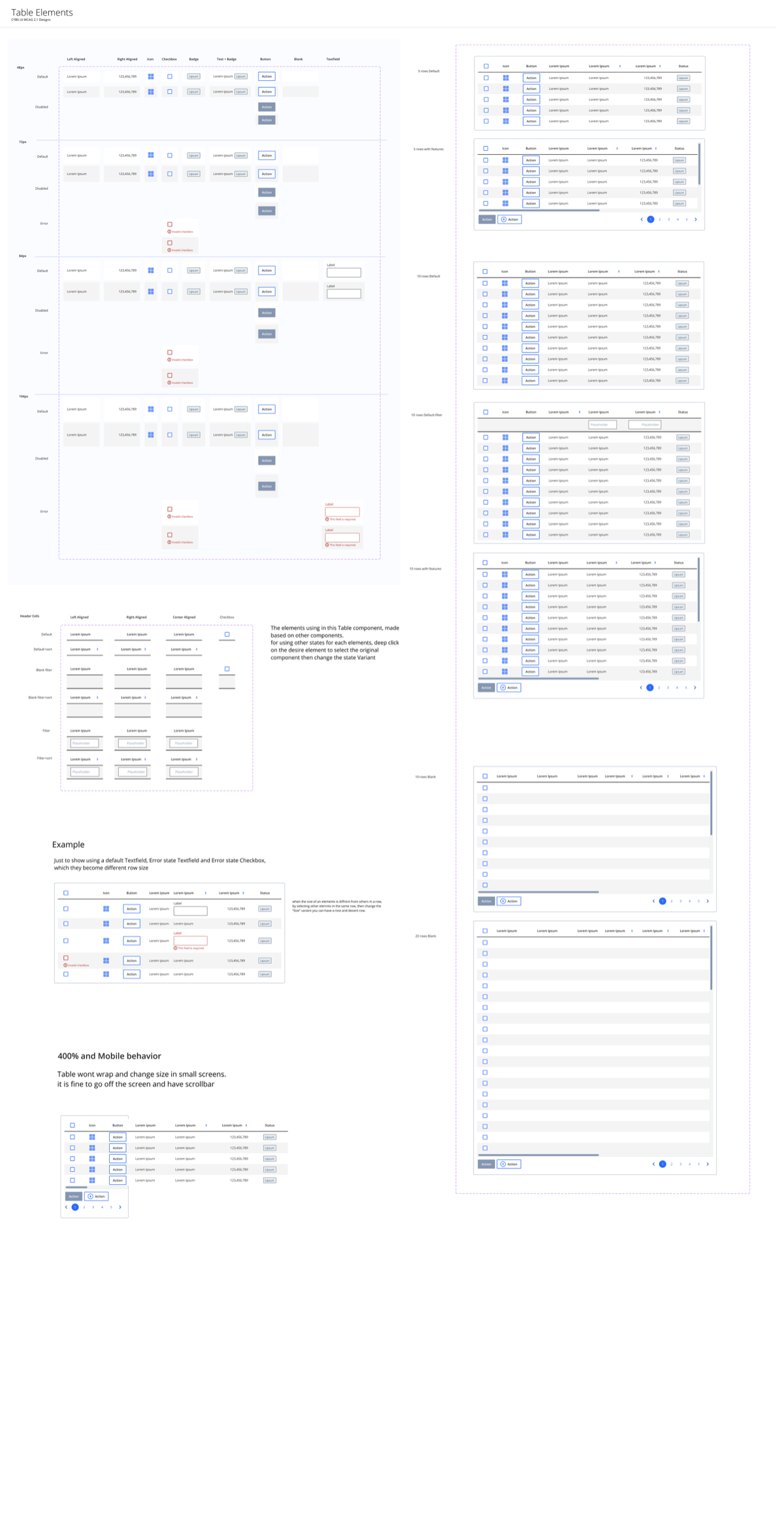
The table is the clearest example because it is the worst case. It has four row heights, and each height has to hold every column type — text, icon, checkbox, badge, button, blank, text field — in default, disabled and error. Header cells add their own sort and filter variants. Then the assembled component has to hold up at five, ten and twenty rows, empty and populated.
Two decisions in that sheet are worth calling out:
- Composition over duplication. The table's cells are the library's existing components rather than table-specific copies, with a note telling anyone using it to select the underlying component and change its state variant. One fix to the text field fixes the table too.
- An explicit answer for 400% zoom. WCAG asks that content stay usable when magnified, and the honest answer for a dense data table is that it should not try to reflow. We specified that it keeps its structure and scrolls horizontally instead — a deliberate decision, written down, rather than something each team rediscovers badly.
This is unglamorous and it is where the value is. Undefined states do not disappear; they get decided later by whoever is implementing, under time pressure, without the context. That is how a system drifts.
The documentation was the deliverable
With six engineers building from this library, anything ambiguous in the file becomes six interpretations or six interruptions. So alongside the components we produced redlines — spacing, sizing, and behavior annotated directly onto real screens.
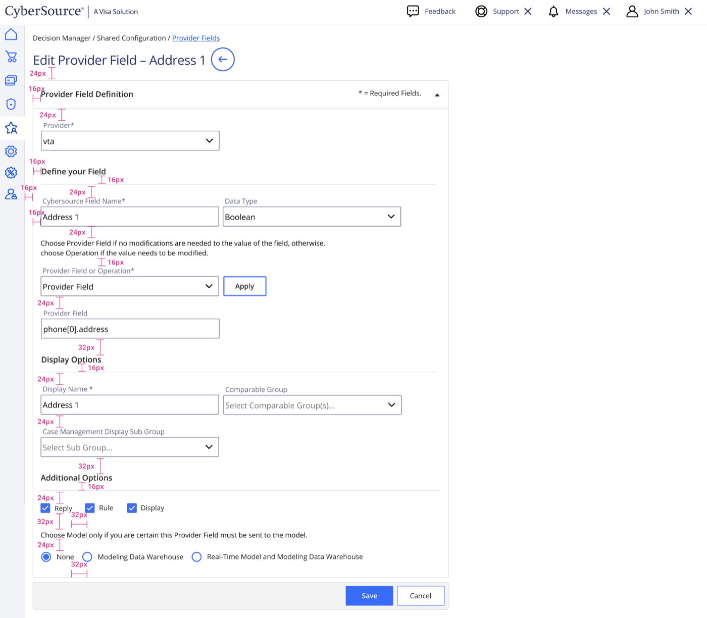
The annotations matter less as individual numbers than as evidence of a system: the vertical spacing resolves to a small repeating set rather than arbitrary values, so an engineer implementing a screen we never drew still gets the rhythm right.
I think of this as the difference between a library that exists and a library that gets used. A component in Figma is a proposal. A component with a specification an engineer can build from without asking a question is infrastructure. Writing the redlines also caught my own gaps — it is hard to document a behavior you have not actually decided.
Working with an accessibility specialist
We had a dedicated accessibility specialist on the program, and every component went through them for approval before it was considered done. Our own checks covered contrast, responsive behavior, and making sure nothing conveyed information by hiding it or by color alone. Their review caught what we could not see from inside the work.
To be precise about scope: this was a component-level review process, not a formal accessibility audit of the products the library shipped into. The library was built and approved to AA; whether a given product assembled it accessibly was that product's responsibility. I have seen portfolios blur that line and I would rather not.
The habit stuck. For the rest of my time at Visa, when a new design raised an accessibility question I could not answer confidently, I took it to the accessibility team rather than guessing — including on the AI assistant work, where the questions got harder and the precedents ran out.
What it enabled
The library went out across CyberSource products, which is the outcome that matters for a design system: it is used by teams the authors never meet.
The part I did not anticipate was how much it would shape my own later work. When I designed the Leo assistant inside the business portal, it could adopt the existing component language and read as part of the product rather than a widget bolted on. When I built a dark mode for the developer assistant from a light-only palette, I already knew how to derive a color role and verify it rather than eyeball it — because I had built the matrix that made verification routine.
What I'd do differently
I would push for the library to be versioned and communicated more deliberately. We built and documented it well, but a design system is a product with users — the teams adopting it — and we treated the handoff as more of an ending than it was. Release notes, a migration path, and a clear way for a team to ask "has this changed?" would have made adoption smoother than good documentation alone did.
I would also start the accessibility review earlier in each component rather than at the end. Reviewing at the end meant occasionally rebuilding something that a five-minute conversation during the first draft would have prevented.