04 / Identity & access
User management — sign-in, roles and approvals for an enterprise portal
Thirteen or more flows, owned end to end, for the least glamorous and least forgiving part of an enterprise product: who gets in, what they may touch, and who has to agree before any of it changes.
- Role
- Sole designer
- Partner
- 1 product owner
- Timeline
- 2023–2025, ~18 months
- Users
- Merchant admins and their users
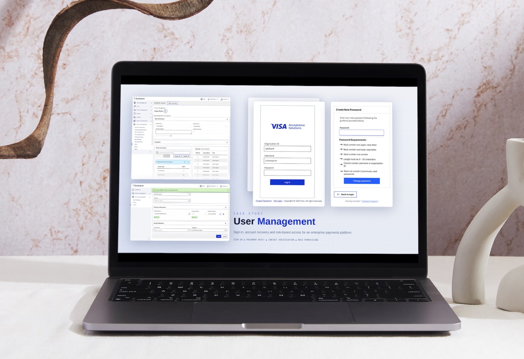
This work is confidential. Screens come from my own design files and all data shown is placeholder data.
Context
Every enterprise product has a user management section, and almost nobody wants to design it. It is forms, tables, permissions and confirmation dialogs. It has no hero screen. But it is also the part where a mistake does not just annoy someone — it either locks a business out of its own money, or lets the wrong person reach it.
The portal made this harder than the usual case. A single person can belong to more than one organization. Administrators delegate to other administrators. Some changes are so sensitive that no one person should be able to make them alone. So "user management" here is not a settings page; it is a small identity and access product with its own rules.
How the work ran
I owned this area for about eighteen months as the only designer, working with one product owner. It never arrived as a project brief. Each flow started from a specific customer complaint or support pattern — someone locked out, an admin unable to grant what they needed, a change nobody could trace — and we scoped it from there. Thirteen or more flows accumulated that way.
Because the same product owner kept returning with the next one, I could design each flow knowing the ones around it. That is why the states are consistent across all of them rather than each screen inventing its own version of a confirmation, an error, or a success message. It also meant the work was continuous in a different sense: designs went out, engineering built them, real behavior came back, and the next flow started from what we had learned.
Sign-in: three fields to two
The original sign-in asked for organization ID, username and password, then offered one button. The redesign asks for organization ID and username, then offers Log in with Passkey as the primary action and Continue with Password as the fallback.
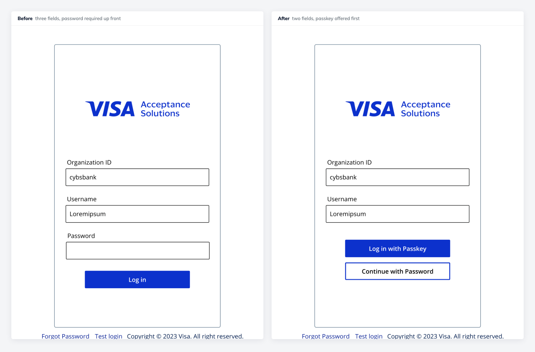
The reason this works is not that a field was deleted. It is that the first step now answers a single question — who are you, and where — and the choice of credential comes after. Once the password is no longer assumed, a passkey can be the default rather than a feature buried in settings, and most people never type a password again.
That is the rare case where the friction and the security argument point the same way. Fewer steps for the person signing in, and a credential that cannot be phished, reused, or read off a sticky note. I did not have to trade one against the other, which is worth saying because in this domain you usually do.
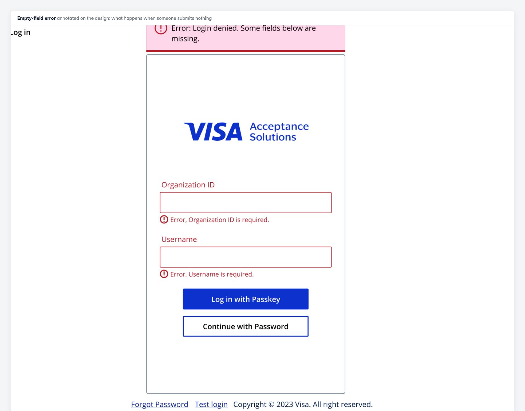
Two things about that error state I would defend anywhere. It says what was wrong and marks the specific fields, because a banner alone makes people hunt. And it never reveals whether an organization ID or username actually exists — a sign-in form that is helpful about which half you got right is a sign-in form that helps an attacker enumerate accounts.
Passkeys, including the unglamorous half
Offering a passkey at sign-in only works if creating one is obvious and removing one is possible. I designed both.
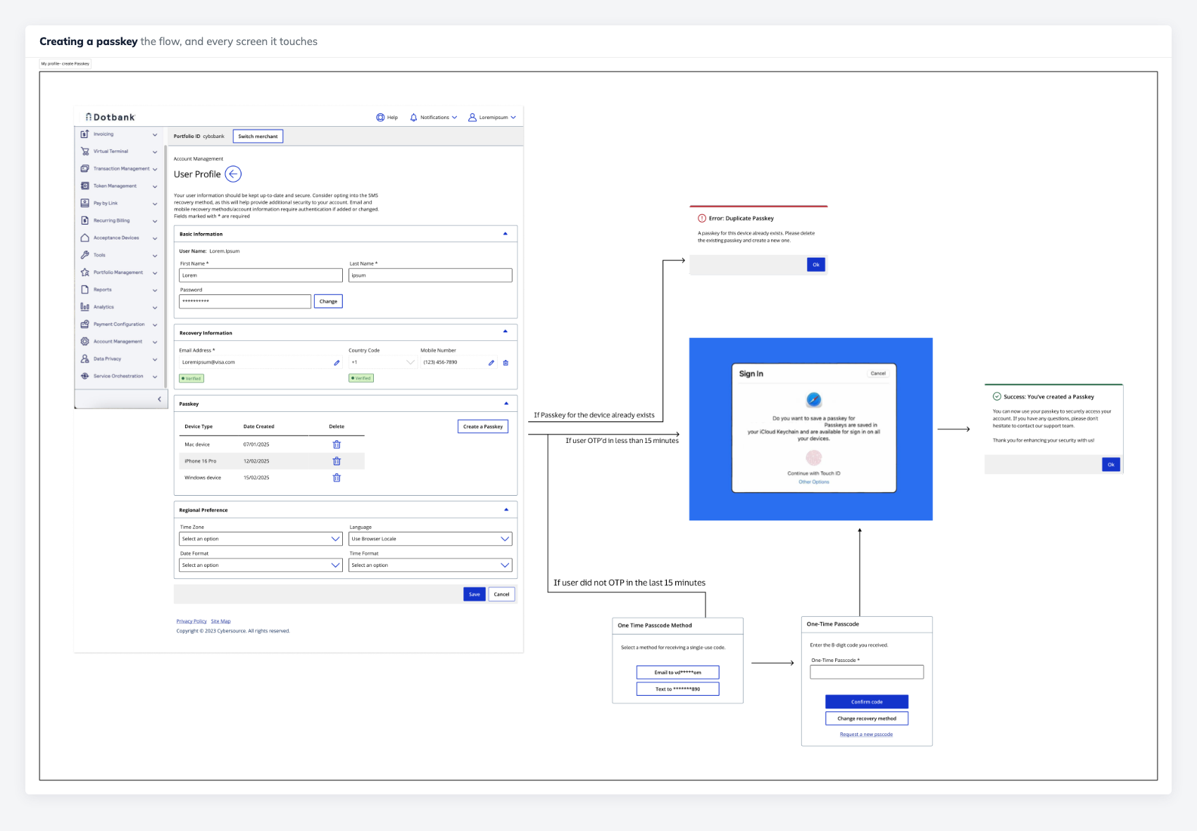
The interesting constraint is that the middle of this flow is not mine. The biometric prompt belongs to the operating system, it looks different on every platform, and it can fail or be dismissed in ways I cannot style. So the design work is the handoff: setting expectations before control leaves the page, and handling every way it can come back — created, cancelled, unsupported device, or timed out.
Deletion mattered just as much. A credential you cannot remove is a liability on a lost laptop, so a passkey has to be revocable from the profile with a clear consequence stated before it goes.
Changing a phone number, without creating a dead end
Recovery details are a quiet security boundary. If someone can change the phone number that receives one-time codes, they can take over an account. So the change has to be verified — and the verification has to not strand people.
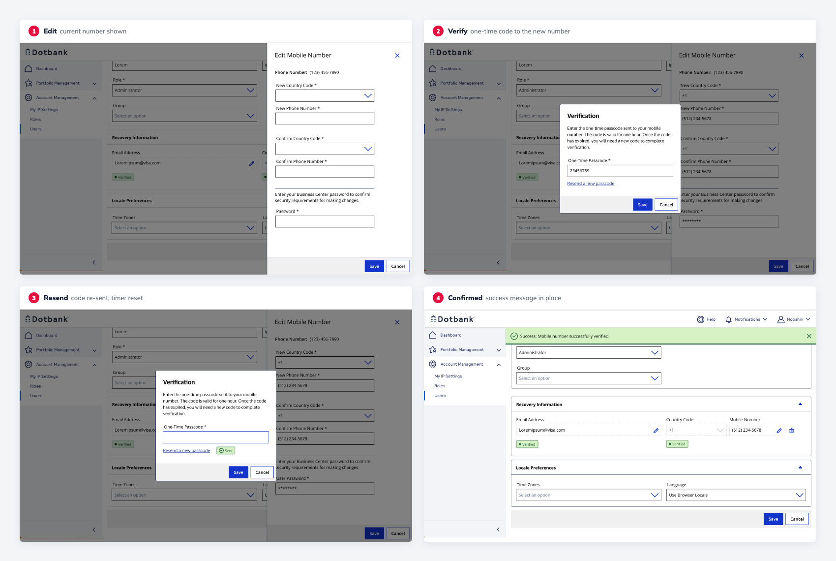
The step I care about most is the third one. A one-time code flow that only handles the happy path fails constantly in reality — codes are delayed, go to an old handset, or arrive after they expire. Without a visible way to request another, and confirmation that the new one was sent, the user's only remaining move is to call support. Designing the resend path is the difference between a flow that works and a flow that generates tickets.
The dialog also asks for the account password before the change, and confirms the new number twice. Both are friction I argued for rather than against, because the thing being protected is the mechanism that protects everything else.
Roles and permissions: the same screen, different powers
Permissions are usually treated as a data problem. They are also an interface problem: two people open the same page and must correctly understand two different sets of possibilities.
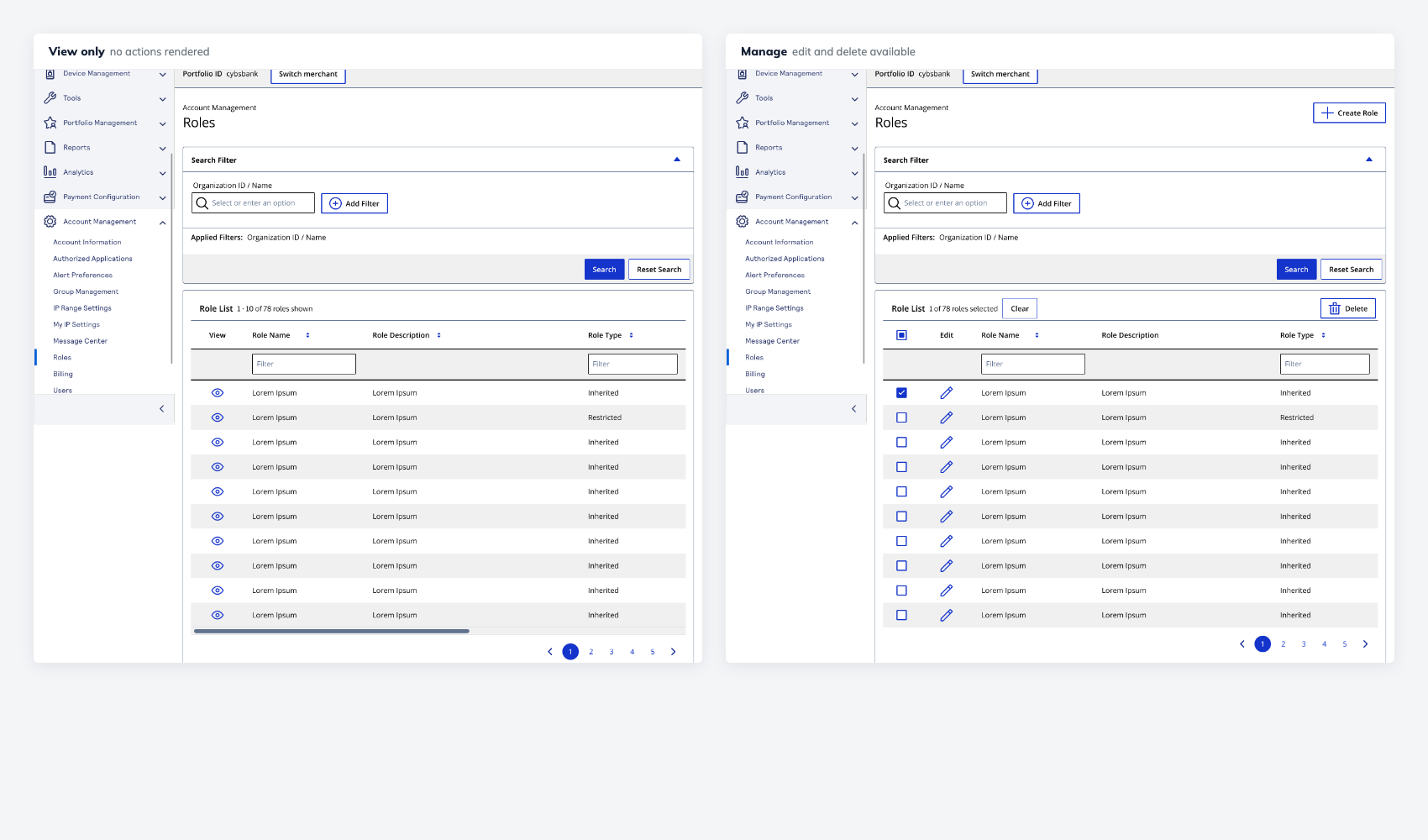
The decision here was to remove actions a user cannot perform rather than show them disabled. Disabled controls are defensible when the user could plausibly enable them — fill in a field, select a row. But a permission is not something you can satisfy by trying harder, so a greyed-out Delete button is only an advertisement for access you do not have. It invites a support ticket and tells you something about the account model you did not need to know.
Maker–checker: nothing important happens alone
For the most sensitive changes, one person is not allowed to act unilaterally. One user proposes; a different user approves. The pattern is standard in banking, and the design problem is that a request now has a life of its own — it can be pending, approved, rejected, or executed and failed, and the two people involved need to know which without asking.
Drawn as a diagram it looks trivial. The work was in the states around it: what the maker sees while waiting, what the checker sees when a request arrives, what happens when a request is approved but then fails on execution, and how each party finds out. A rejection that does not explain itself is worse than no workflow at all, because the maker simply submits it again.
One username, many organizations
The subtlest problem in this area had no screen at all. The same username can exist in more than one organization. Sometimes that is genuinely one human being with access to several businesses; sometimes it is two different people who happened to pick the same name.
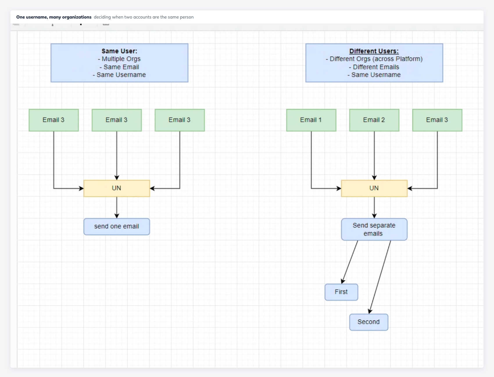
It matters because of notifications. Send one email when it should have been two and somebody learns about an account that is not theirs. Send two when it should have been one and a legitimate user gets duplicates and starts ignoring them — which is worse, because these are the security emails.
The resolution was to treat the email address as the identity and the username as merely a label. Same email across organizations means one person and one message; different emails mean different people and separate messages, even when the username matches. Writing that rule down was more valuable than any screen in this case study, because it removed a question that would otherwise have been answered differently in every flow.
What I'd do differently
I would have pushed for a written model of the permission system at the start rather than deriving it flow by flow. By the tenth flow I understood the rules well; I would have designed the earlier ones better with that understanding, and some of my early screens were more consistent by revision than by intent.
What I would keep is the sourcing. Every flow here began with an actual person who could not do something, which is why none of it is speculative and why the product owner kept coming back. That is not a design method anyone teaches, but for a part of the product with no hero screen and no obvious roadmap, following the complaints was the most reliable way to find work worth doing.