02 / AI Assistant
Developer AI assistant — from full-screen to floating
The discovery work found something uncomfortable: the problem was not that documentation was missing, it was that nobody could tell which of it was true. Designing an assistant on top of that meant designing how much certainty it was allowed to project.
- Role
- Designer on both versions
- Team
- 2 designers on full-screen, 3 time zones
- Timeline
- 2024–2026, recurring
- Users
- Internal and external developers
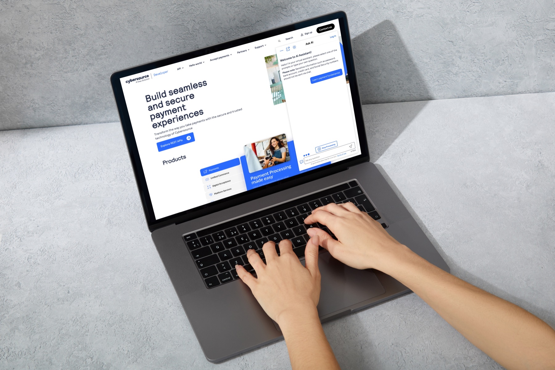
This work is confidential. Screens come from my own design files, and photographs of them have been cleaned and cropped.
The problem underneath the problem
CyberSource's developer portal is where developers go to integrate payments — documentation, API references, and sample code. The obvious brief for an assistant there is "help people find things faster."
The pain points documented at the outset told a more awkward story. Internally, nobody owned the accuracy of documentation. The wiki could be edited by anyone, so there was no way to know whether a given page was current — the notes put it plainly: it is not reliable. Nobody was sure who held knowledge for which part of the product, or who the owner of a given area even was. In large teams, when people left, the accuracy of what they had written left with them. The notes end with two questions I still think are the right ones to have asked: technology solution? organization solution?
That reframed the design work. An assistant that answers instantly and confidently from sources whose accuracy nobody owns does not fix the trust problem — it launders it. Speed makes an unreliable answer arrive faster and sound more authoritative.
So the through-line for everything below is calibration: the assistant should be fast and genuinely useful, while being consistently honest about what it is and what it might get wrong. Every caveat in these screens is deliberate, not legal boilerplate.
A destination and a companion
I joined the full-screen version as one of two designers with a product manager. It is a destination: you go to it, and it behaves like a place you work. It keeps a searchable history with conversations you can pin or delete, and it opens by helping you classify your own question before you have to phrase it.
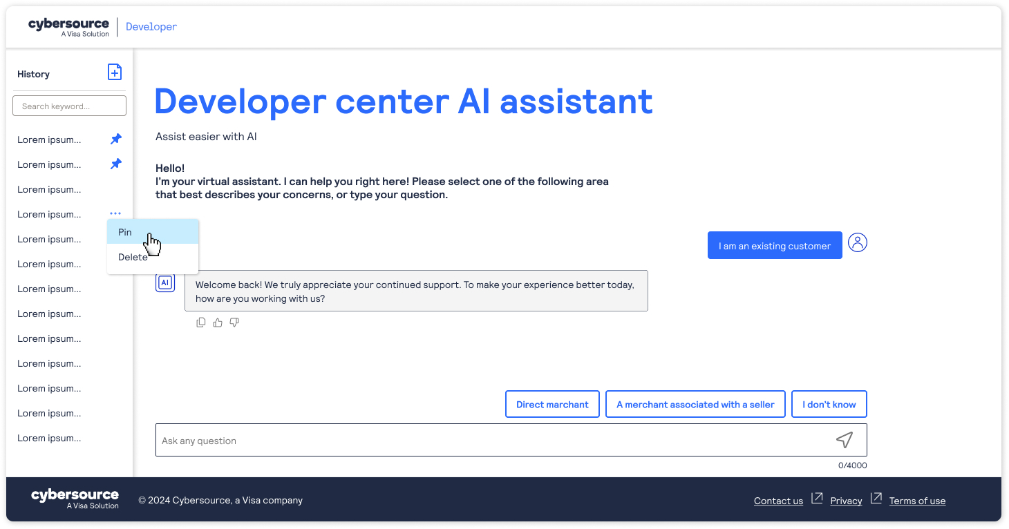
The entry chips include "I don't know." That option matters more than it looks. Asking a developer to self-classify assumes they already understand the taxonomy, and the people who most need help are exactly the ones who do not. Without an escape hatch, a guided start becomes a quiz you can fail on the first screen.
When the team decided to build a floating version, she came back to me and I designed that one alone. The floating panel is not a smaller destination — it is a different product. You do not go to it; you pull it alongside whatever you are already reading, and it has to earn the space it occupies.
How the work actually ran
The project spans two years, but not two continuous years of designing. It went full-screen first, then months of supporting engineering while they built it, then the product manager returning to ask for the floating version, then the same cycle again. Requirements moved constantly as feedback came in, so almost nothing was designed once and finished.
None of it happened in a room. I was in Austin, the product manager was in Seattle, and the engineers building it were in India — three time zones with barely a working hour in common. That shaped the deliverable more than any single design decision. A screen I could not explain in writing was a screen that would get built wrong overnight, so specs, states and edge cases had to be unambiguous before I logged off, not clarified in a meeting the next morning.
The long tail was the real work. After the designs were signed off I stayed on to answer engineering questions, supply detail that had not come up until someone tried to build it, and extend the design to five viewport sizes — mobile, tablet, and three desktop widths — because a panel that has to coexist with a live console behaves differently at every one of them. I supported it until the product shipped.
Why the floating version was the harder one
The full-screen assistant has the page to itself. The floating one competes with the densest screens on the site.
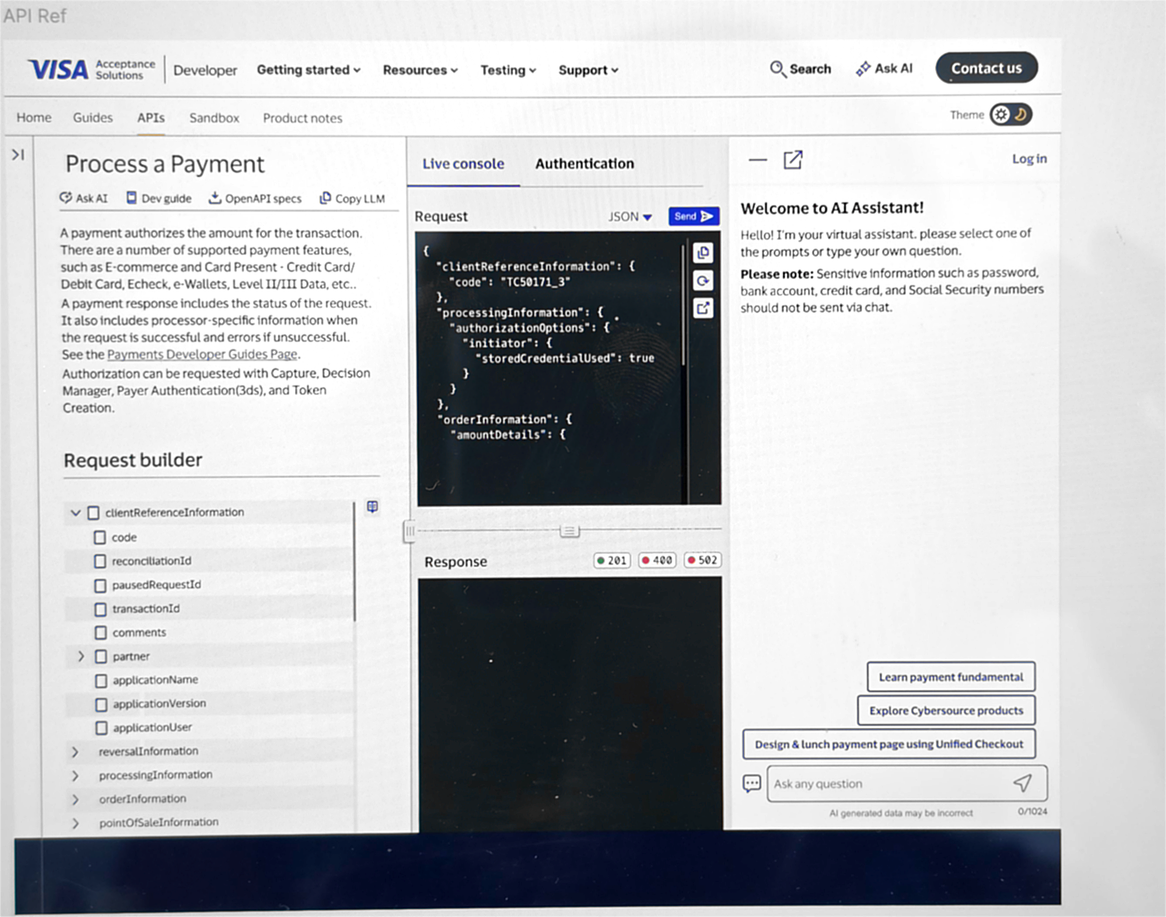
This is the screen that set the constraints. A developer testing a request already has reference text, a field tree, a JSON request and a response pane in play. The assistant cannot take the page, and it cannot be so narrow that the code it returns wraps into nonsense.
So the panel carries its own controls, and each answers something specific:
- Minimize — get out of the way without losing the conversation.
- Expand — for longer code, take more room temporarily rather than permanently. This is why the expanded state exists at all.
- Theme — switch light and dark from inside the panel, because the assistant sits next to a code console that is already dark.
The input limits differ by form factor for the same reason: 4,000 characters in full-screen, 1,024 in the floating panel. A limit is a promise about what the surface can handle gracefully, and a panel that can only show a few lines at a time should not invite an essay.
Where to put the wall
Not everything the assistant does is free. General questions are open to anyone as a guest. When a developer hands over their own code, or asks the assistant to generate code, they need to be signed in with an enterprise account.
That puts a boundary in the middle of a conversation, which is an awkward place for one. Sign-in is normally a door you walk through before you start; here it appears partway in, triggered by what was asked rather than where someone clicked. I designed around three rules:
- Let people reach the value before asking. Requiring sign-in at the first message would turn away developers who wanted a quick answer and never needed an account. Log in stays visible in the panel header from the start, but it is an offer, not a gate.
- Never lose the conversation. The prompt that triggered sign-in is the whole reason the developer is there. Sign-in happens inside the assistant and the conversation survives it, including the request waiting to run.
- Explain why, at the moment it happens. A sign-in prompt with no reason reads as an obstacle. The same prompt that says this is because your code is involved reads as a boundary that makes sense — and for a payments company, that is the correct handling of someone's integration rather than a growth tactic.
Two terms-of-use paths
Sign-in carries terms of use, and I designed two ways through them rather than forcing one.
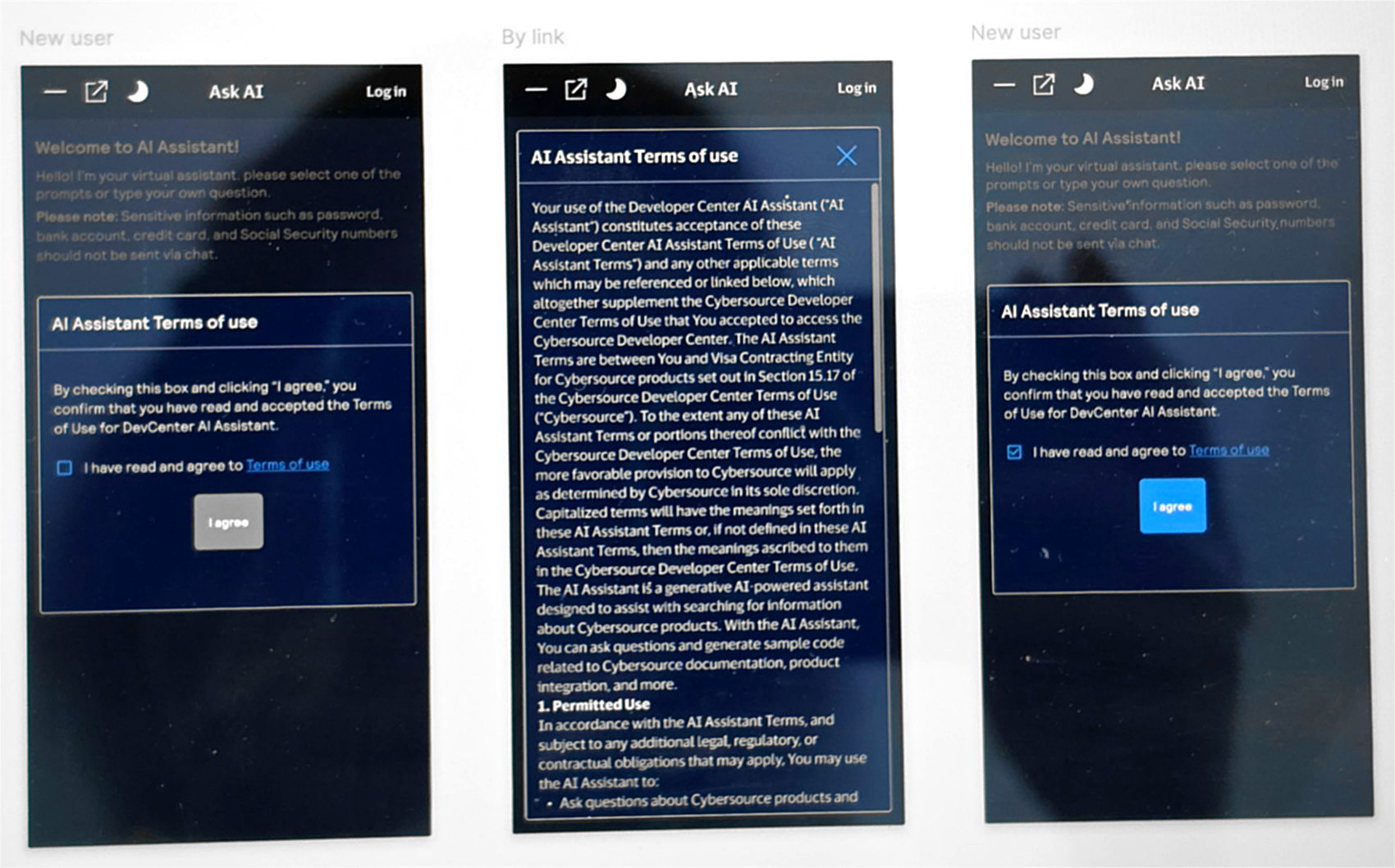
The new user path keeps consent inline: a short summary, a checkbox, and an "I agree" button that is disabled until the box is ticked. The by link path opens the full legal text in a scrollable modal for anyone who wants to read what they are agreeing to, without dumping it into the conversation for everyone who does not.
Keeping the button disabled is a small thing that I would argue for again. An enabled button next to an unchecked box invites a click that has to be rejected, which teaches people that the interface is not paying attention. Disabling it makes the requirement legible before anyone fails it.
Building a dark mode that did not exist
Developers work in dark editors, and this assistant sits beside a code console. The problem was that the brand maintained a light palette only — there was nothing to inherit.
Inverting a light palette does not work, and it is worth being precise about why:
- Contrast is not symmetric. A color that clears AA on white usually fails on near-black. Every value had to be re-derived and re-checked, not flipped.
- Elevation reverses. In light mode, surfaces above the page get shadows. In dark mode shadows disappear into the background and lightness has to do that job.
- Semantic colors drift. Error and success have to stay recognizable while changing enough to remain legible on a dark surface.
- Code is the hard case. This assistant returns code, so syntax colors needed a full dark treatment against the code block background, not just the body text.
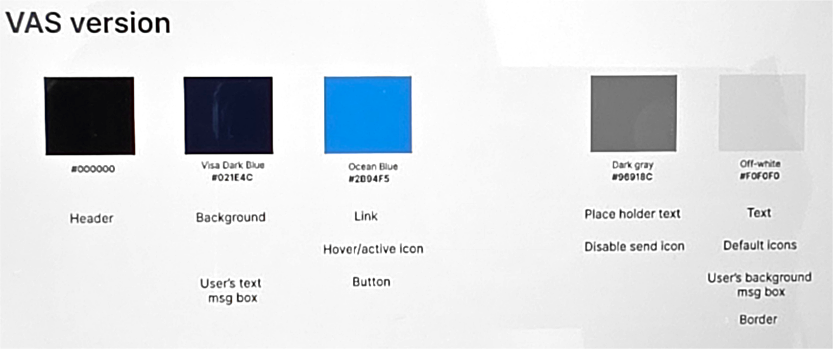
I built it the same way I had learned to build the component library: define colors as roles with a stated job, then verify by measuring rather than by looking. Where a brand color could not clear AA on dark at any usable lightness, I raised it rather than shipping something that technically matched the brand and failed the people using it.
A dark mode is not a filter over a light one. It is a second palette that has to survive the same tests.
Two brands, one structure
The assistant had to appear under both CyberSource and Visa Acceptance Solutions branding — different palettes and different component styling, not one theme with a hue swap.
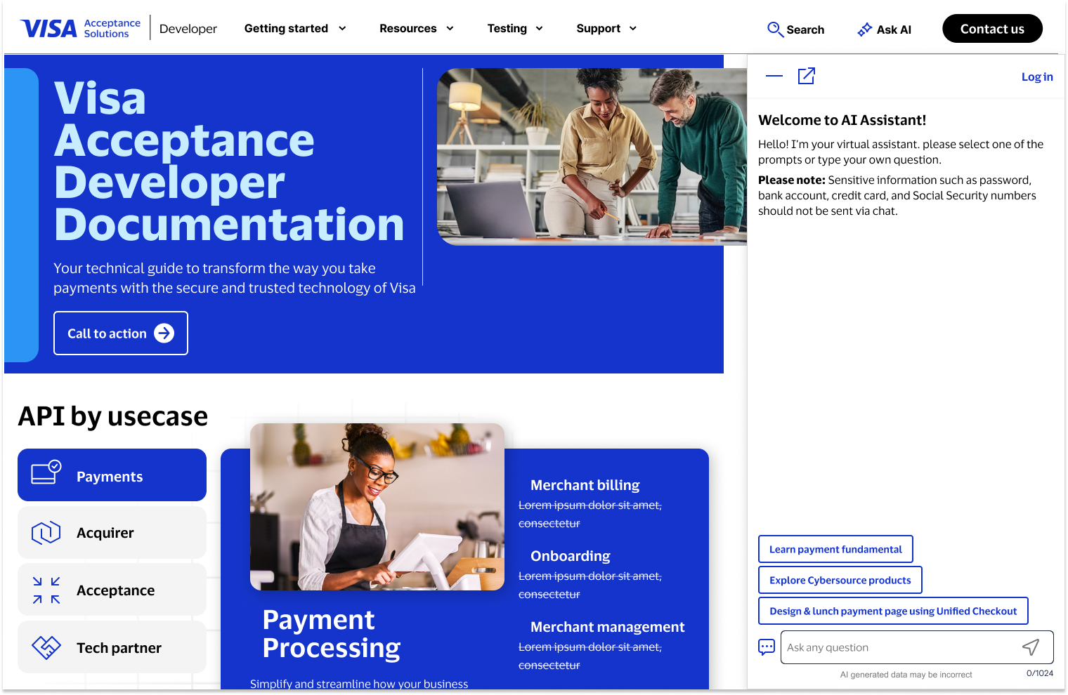
The useful discipline was separating what changes from what does not. Layout, spacing, conversation structure, the sign-in boundary, the caveats and every state stay identical. Color, type treatment and component styling are the skin. Keeping that line clean meant a brand decision never reopened an interaction decision, and engineering had one structure to build rather than two products.
What I'd do differently
I do not have usage data or user feedback for this one — it was not shared with me, and I would rather say that than invent a result. What I can say is which decision I would most want to check: the exact placement of the sign-in wall. We drew it at "your code is involved," which I still think is the right principle, but the edges are fuzzy. A developer pasting an error message that happens to contain a fragment of their code is a case I would want to watch a real person hit.
The dark mode work I would do the same way again. Deriving it properly took longer than approximating it, and it is the part most likely to still be correct years from now, because it was built against measurable criteria rather than taste.
And I would keep the caveats. It is tempting to treat "AI generated data may be incorrect" as noise to minimize. Given what the discovery work turned up about how documentation is actually maintained, that line is the most honest thing on the screen.