01 / AI Assistant
Leo — an AI assistant inside an enterprise payments portal
The portal could do almost anything, if you already knew where to look. I designed an assistant that takes a request in plain language and carries it out — and never completes an action without asking first.
- Role
- Sole designer
- Partner
- Product director, remote
- Timeline
- 2024–2026, recurring
- Users
- Business merchants
This work is confidential. Screens are photographs of my own design files, redacted, and some details are generalized.
Context
Visa's Business Center is where merchants run the money side of their business — transactions, reporting, payment credentials, users and permissions. It is powerful and it is dense. The problem statement we started from named two things directly: the interface was not intuitive and was difficult to navigate, and there was no way to get a specific answer quickly. Merchants who used it daily learned their way around. Everyone else asked someone.
Leo was the product director's answer to that. She was based in California and I was in Austin, so the entire project ran remotely. I was the only designer on it, partnered directly with her — which meant I was not handed screens to draw. I was part of deciding what the assistant should be able to do at all.
The work spans two years, but not two continuous years. It began with discovery and an MVP, and after that it arrived in waves: she would come back every few months with a new use case or feature to add, and between those rounds I supported the design through changes and feedback as the product met real constraints. The seven use cases accumulated that way rather than being scoped in a single pass — which is its own kind of endorsement, since each round was a decision to come back rather than hand it to someone else.
Working that way across two time zones also set the standard for how much had to be written down. A decision I could not explain in a document was a decision that would not survive the gap between one round and the next.
Three kinds of stuck
The requirements work identified three user situations, and they turned out to be a useful spine for the whole project because each one needs something different from an assistant:
- The new user who has no idea where to start. "After I logged in, I had no clue what I needed to do first." This person needs orientation, not execution.
- The user who knows what they want but not where it lives. "How can I give my users different permissions?" This person needs the assistant to either navigate them there or do it for them.
- The user who needs judgement, not just a location. "I'm seeing more frauds in Asia — what configurations can I use to monitor fraud in this region?" This person needs the assistant to know the product deeply enough to advise.
Those three ask for escalating levels of trust, and that framing set the rule I applied everywhere after: the assistant can find, prepare, and assemble on its own, but a person confirms anything that changes state. It can answer, draft, and gather. It does not send, pay, delete, or grant access without an explicit yes.
I prototyped seven use cases end to end. Two of them show that rule most clearly.
Retrieval, then a confirmation
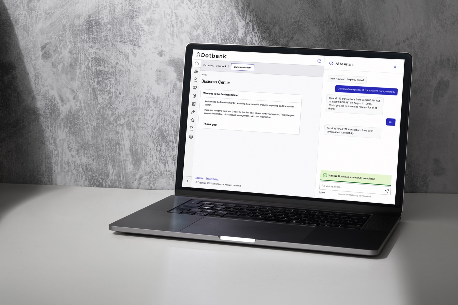
The first is deliberately mundane: a merchant wants receipts for yesterday's transactions. In the portal that means going to transaction search, constructing a date filter, selecting results, and exporting. In the assistant it is one sentence.
What matters is what happens next. Leo does not download anything. It reports what it found — 102 transactions, with the exact time window it interpreted "yesterday" to mean — and asks whether to proceed. Only after a yes does it act, and then it confirms completion both in the conversation and as a success message in the interface.
Stating the interpreted time range is the important detail. "Yesterday" is ambiguous across time zones and cut-offs, and a merchant reconciling books needs to know exactly which window they are getting. Showing the resolved range turns a guess into something checkable before it costs anyone time.
The assistant's job is to get you to the right action faster. It is not to decide that the action is right.
Permissions, with an approval gate
The second flow is the one I would show first if I had thirty seconds. A merchant admin needs a new role — say, a fraud team that can search transactions and export results but change nothing. In the portal this means understanding a permissions matrix. In the assistant, the admin describes the job and Leo assembles the permission set.
Three decisions in that flow were the ones I argued for:
- Every permission is listed with a description. Granting access is exactly the kind of task where a confident summary is dangerous — an admin who approves a list they do not understand has been badly served, even if the list is correct.
- The approval is a distinct step with its own language. Not a "confirm" button on a form, but a direct question — do you approve this? — answered in the conversation, so the record of who approved what lives in the same thread.
- The follow-ups are offered, not assumed. After the role exists, Leo suggests adding another permission or adding users to it, as chips. The obvious next steps are one tap away without the assistant taking them on its own initiative.
This flow also connects to work I had already done. I spent a year and a half redesigning this portal's user-management section — roles and permissions, maker–checker approvals, self-service unblock. Leo did not replace that work; it gave the same tasks a second, faster entry point for people who knew what they wanted but not where it lived.
Designing for the answers that are wrong
An assistant in a payments portal will be wrong sometimes. The design question is not how to prevent that — it is what happens when it does, and whether being wrong produces anything useful.
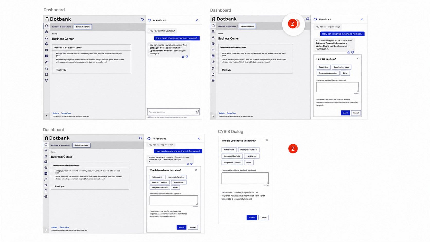
Every answer can be rated, and a rating opens a short structured follow-up rather than a blank comment box. The taxonomies are deliberately different depending on the direction:
- Positive ratings ask what kind of value it delivered — saved time, resolved my issue, answered my question. Useful for knowing which use cases are worth expanding.
- Negative ratings ask what kind of wrong it was — not relevant, incomplete or unclear, incorrect or bad info, hard to use, too generic or robotic. Those are different failures with different owners: bad info is a data problem, an unclear or robotic answer is a copy problem, hard to use is an interaction problem.
A free-text box alone would have been easier to build and nearly useless to act on. Splitting the reasons meant a month of feedback could be read as a queue of specific fixes. The dialogs also carry a plain warning not to include personal or confidential information, because feedback gets reviewed by people.
Two smaller honesty affordances sit in the same family: the input is capped at 250 characters with a live counter, and a persistent line under the composer says AI generated data may be incorrect. In a product where the numbers are someone's money, that line is not boilerplate — it is the reason the confirmation gates exist.
Invoicing, eCheck, and proactive alerts
Three more of the seven use cases I can describe but not show, because I do not have shareable screens of them.
Conversational invoicing replaced a long form. A merchant either uploads a document or describes the details in chat, and the assistant extracts them into a structured draft invoice — shown in full, every field editable, before anything is sent. The conversation is the input method; the invoice is still reviewed as an invoice. eCheck followed the same shape with a heavier confirmation step, since a payment actually moves.
Proactive alerts flipped the direction. Everything above starts with the merchant asking, but the most expensive problems in the portal are the ones nobody thinks to ask about — an expiring payment key, an expiring password, quiet until an integration starts failing. I designed a concept where those surface on the Leo icon and can be resolved in the conversation. This stayed a proof of concept and was not built; we were early enough in the product that it did not get prioritized, and I would rather say so than imply it shipped.
Consistency and accessibility
Leo had to sit inside a portal I already knew well, using the existing component language so it read as part of the product rather than a widget bolted onto it. Where I needed something new, I checked it against the design system first and took accessibility questions to our accessibility specialist rather than deciding alone.
Conversational interfaces raise questions that forms do not — where focus goes when a response arrives, how a screen reader user knows the assistant is working, whether a returned result is reachable without a mouse. Those mattered more to me than the styling of the chat bubbles.
What I'd do differently
I would push harder and earlier for testing with real merchants. Each round of scoping was done with the product director from a genuine understanding of the portal and from documented user problems, and I still believe the seven use cases were the right seven. But "we believe this is painful" is a hypothesis, and with two years of rounds there was ample opportunity to check one against real people. I designed further on it than I would have liked before that happened.
What I would keep is the confirmation rule. Every time we discussed letting the assistant act autonomously to save a step, the honest answer was that the saved step was small and the trust cost was large. In a payments product, an assistant that is slightly slower and never surprises you is the better product.